Category
- Local businesses
A few details are enough to get started. We’ll get back to you personally.
We’ll get back to you as soon as possible.
Please try again.
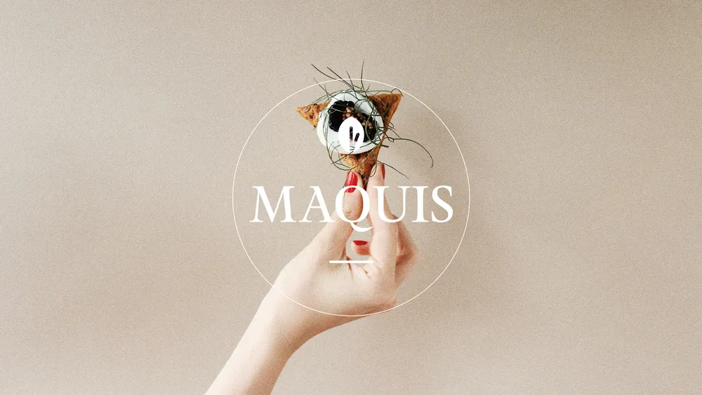
Maquis is a vegetarian bistro in Hamburg — a personal, welcoming place for creative vegetable-led cooking made with regional ingredients and careful craft.
For Maquis, a characterful vegetarian bistro in Hamburg-Altona, we developed a new visual identity that reflects the restaurant’s approach: crafted, responsible and approachable. The new brand brings the team’s philosophy into focus, connecting French bistro tradition, produce from northern Germany and creative vegetable-led cooking. A visual web design extended the atmosphere of the dining experience into the digital space.
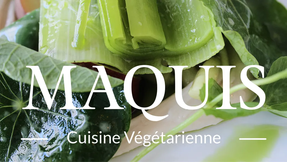
Maquis is more than somewhere to eat. It invites people to slow down and enjoy the experience. The challenge was to translate its combination of precise craft, refined cooking and northern German groundedness into design — without decoration for its own sake, but with real depth. Everything here is made by hand, from the bread to the atmosphere.
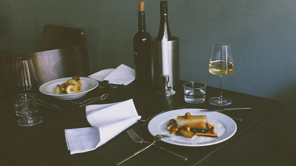
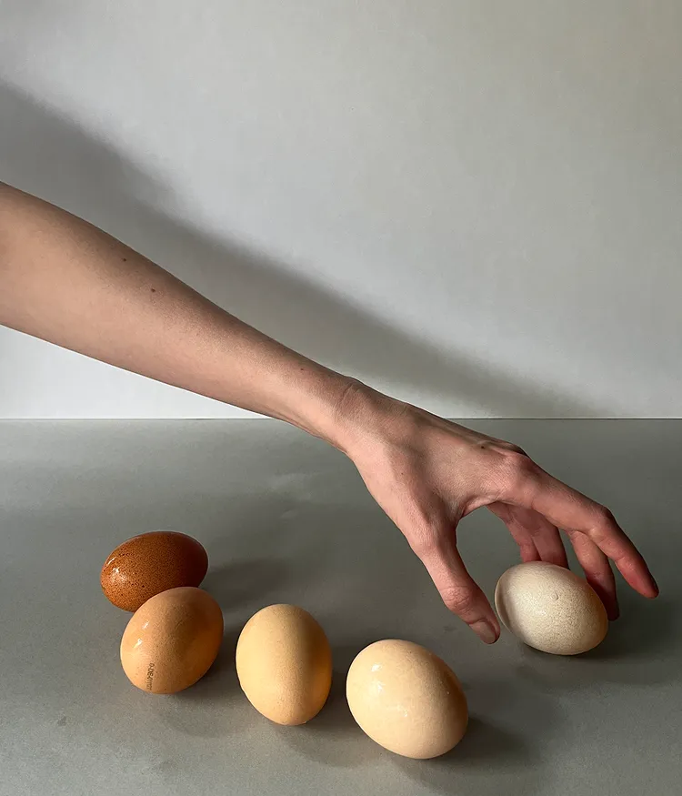
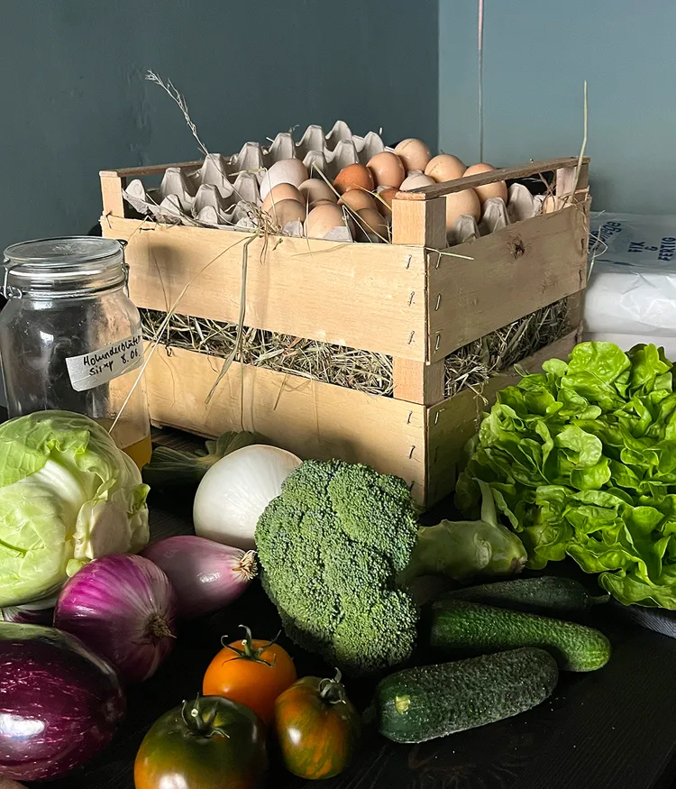
To position Maquis clearly, we immersed ourselves in the restaurant: conversations with the team, time spent understanding the kitchen and service, a look at the competitive landscape and, most importantly, a close view of what makes Maquis distinct.
Maquis represents a kind of cooking that needs no grand claims but has plenty to say: vegetarian, regional, carefully crafted and quietly self-assured.
We brought these qualities into a clear brand foundation, a distinctive profile and a brand architecture that guides strategy, design and language.
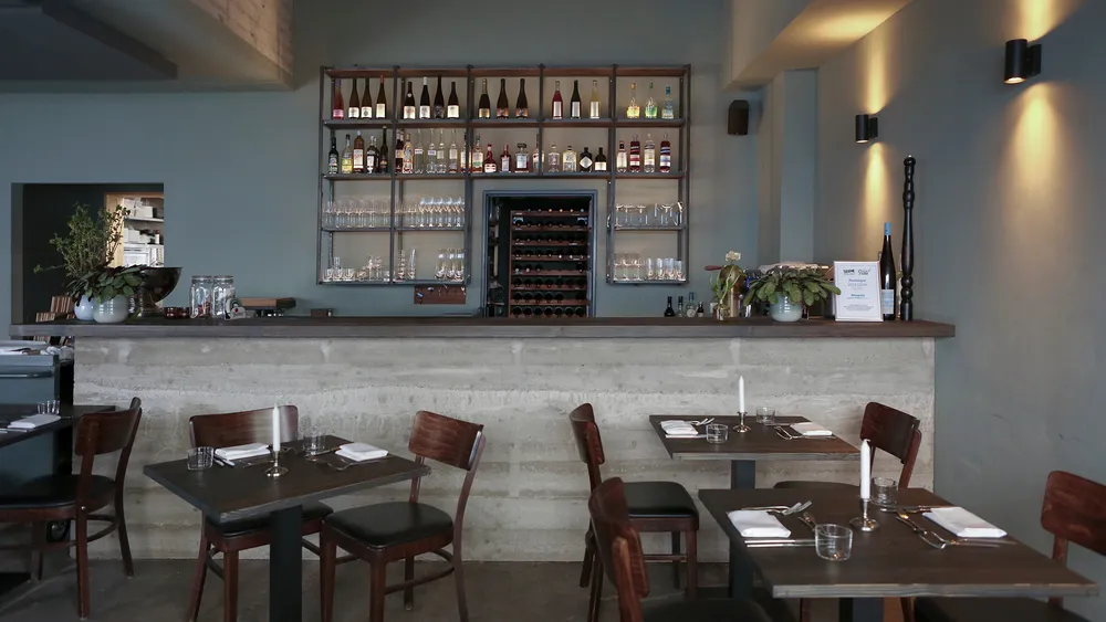
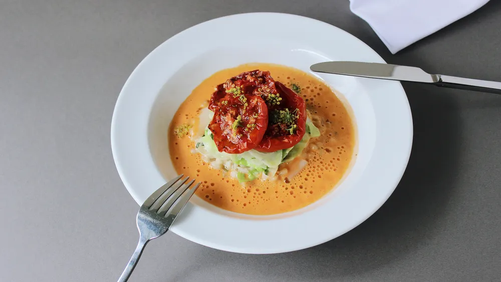
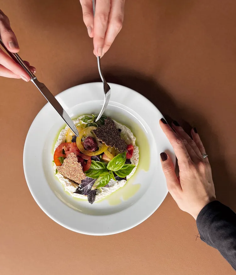
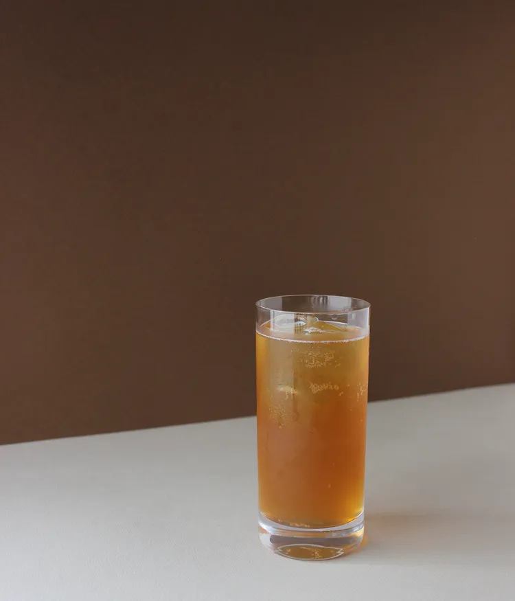
Maquis is not an off-the-shelf concept. It grew from experience, personality and a clear culinary point of view. Together with the team, we uncovered the restaurant’s essence and developed a brand strategy that shows what is genuine without over-staging it.
At its core, Maquis is a modern vegetarian bistro that puts quality ahead of spectacle — rooted in the region, shaped by craft and carried by openness. The strategy captures that quiet conviction, cultural depth and human warmth in a way that invites rather than excludes.
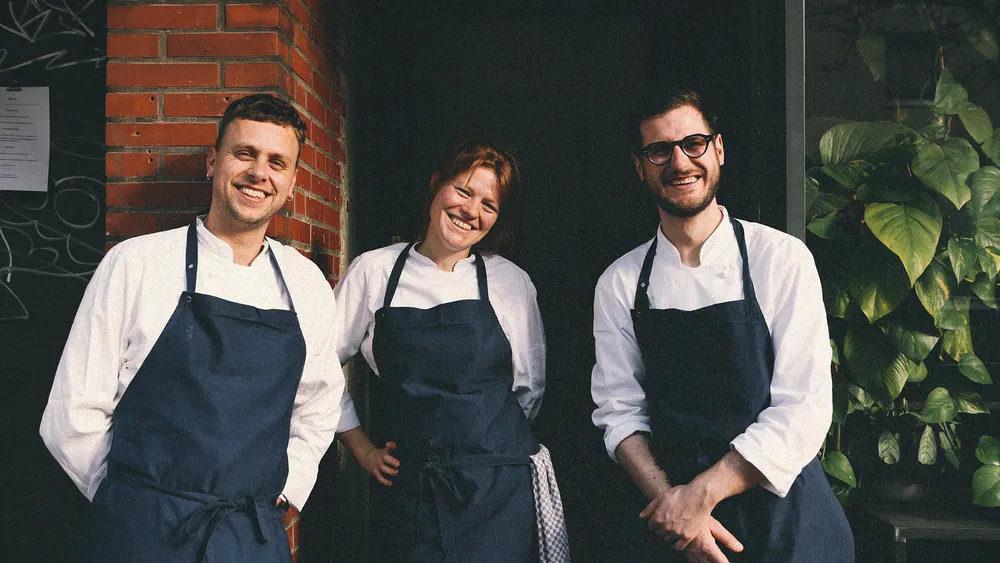
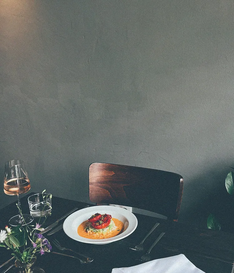
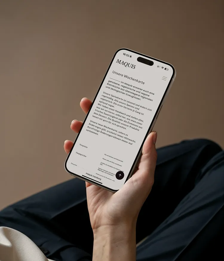
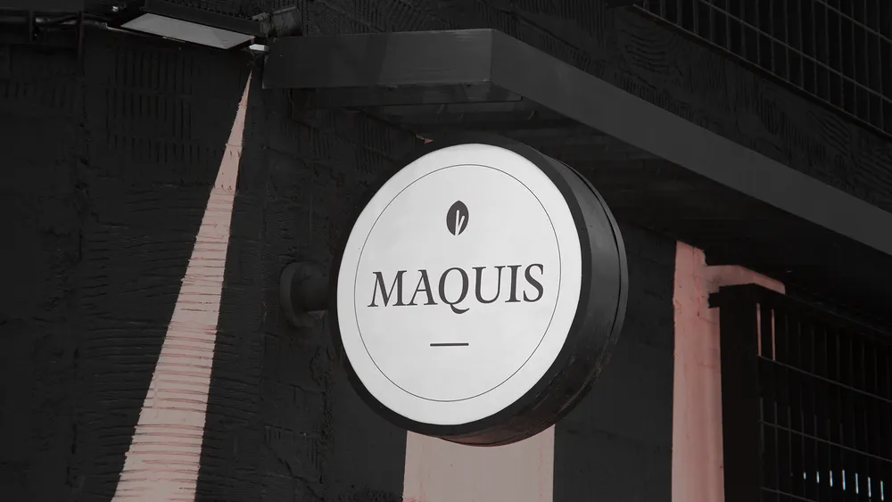
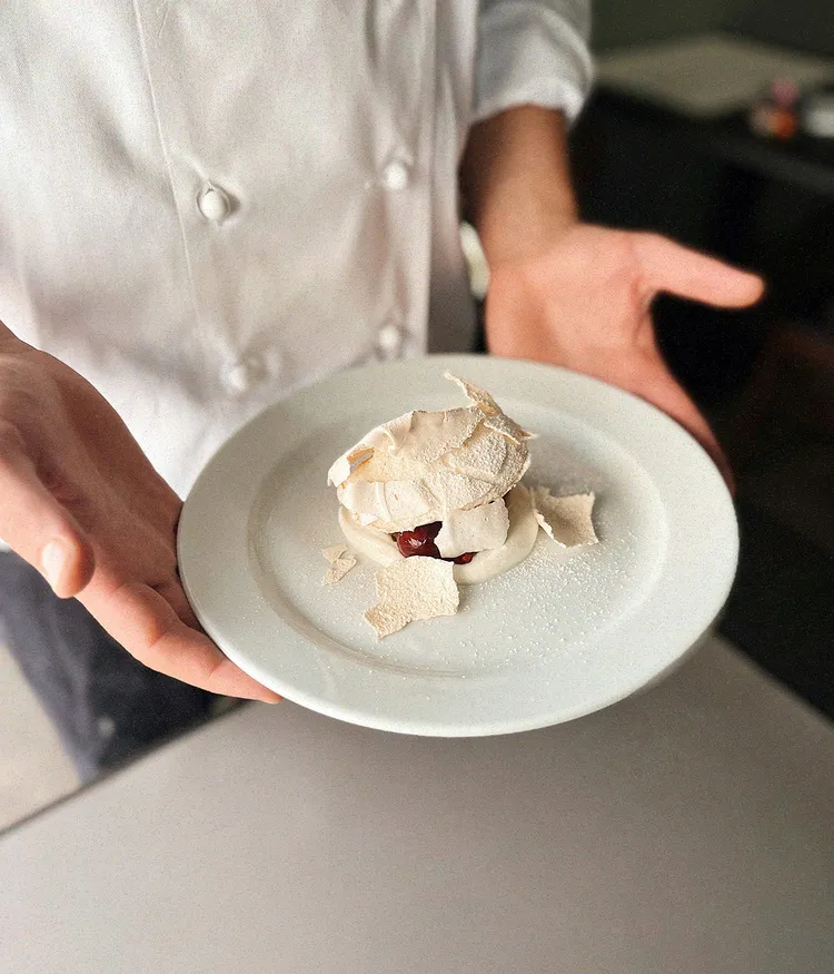
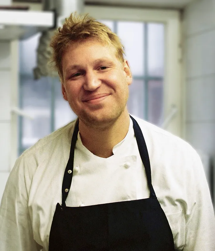
We created an identity that captures Maquis at its most essential: genuine, restrained and approachable. An organically shaped logo, a calm, warm colour palette and a visual system bring clarity without smoothing away its character. Serif-led typography adds a human note, while a hand-drawn leaf becomes a subtle symbol of craft and nature.
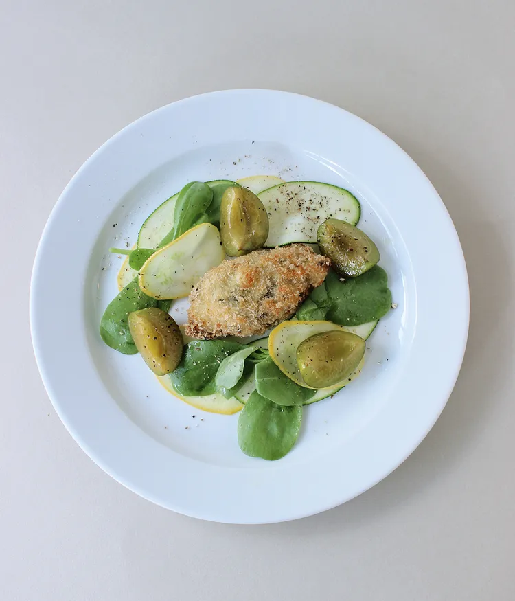
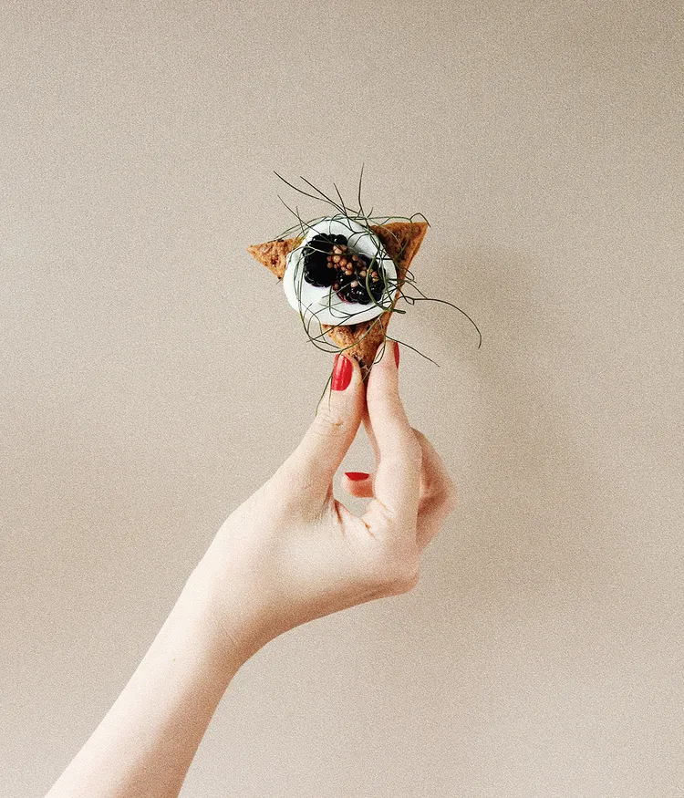
Maquis does not speak loudly. It speaks clearly. The language is calm, direct and considered, much like the restaurant itself. Across the website, tagline and booking flow, the tone communicates warmth, quality and personality without pretension.
It avoids grand statements and instead creates an atmosphere in which guests feel understood.
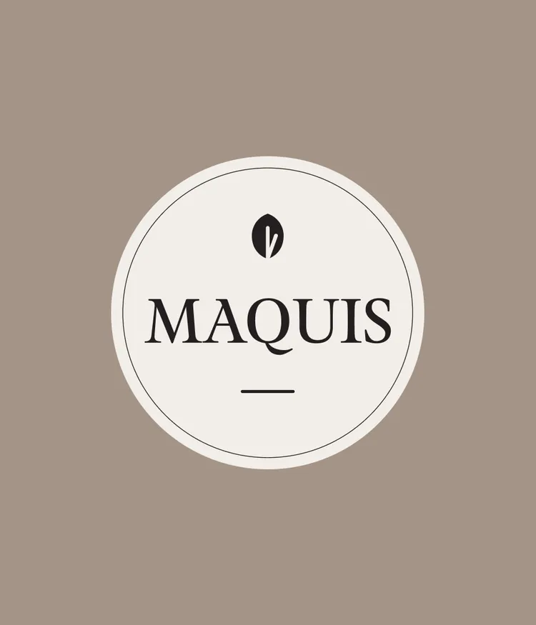
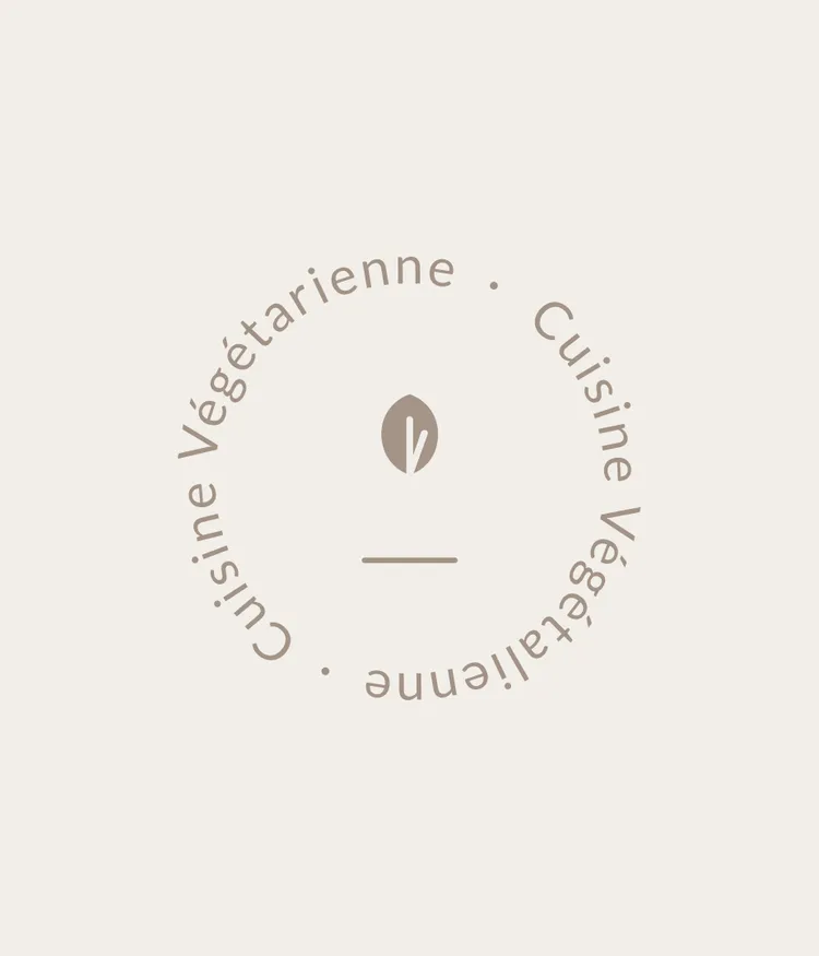
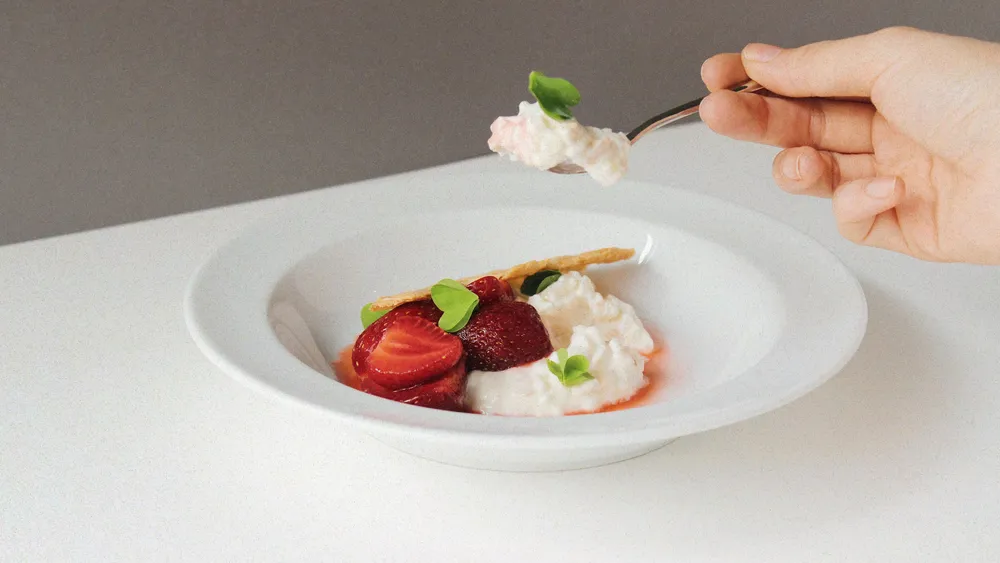
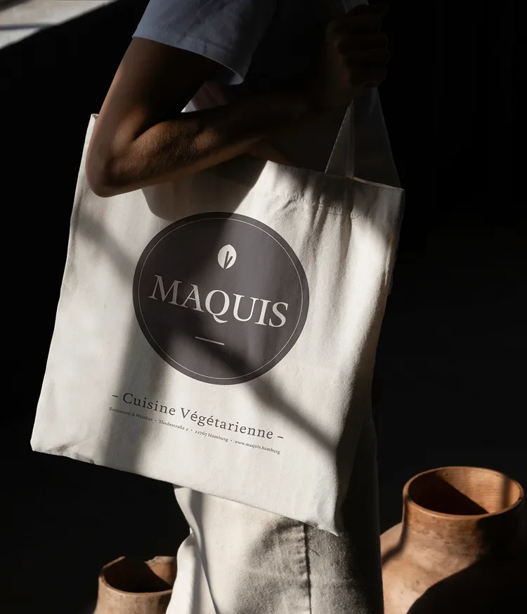
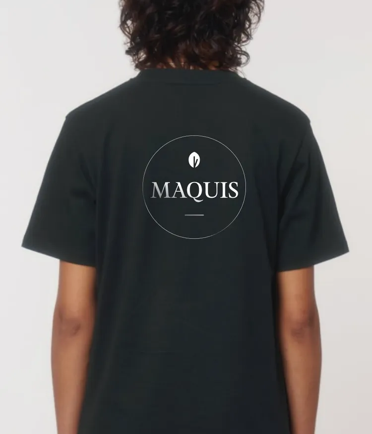
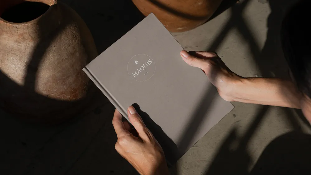
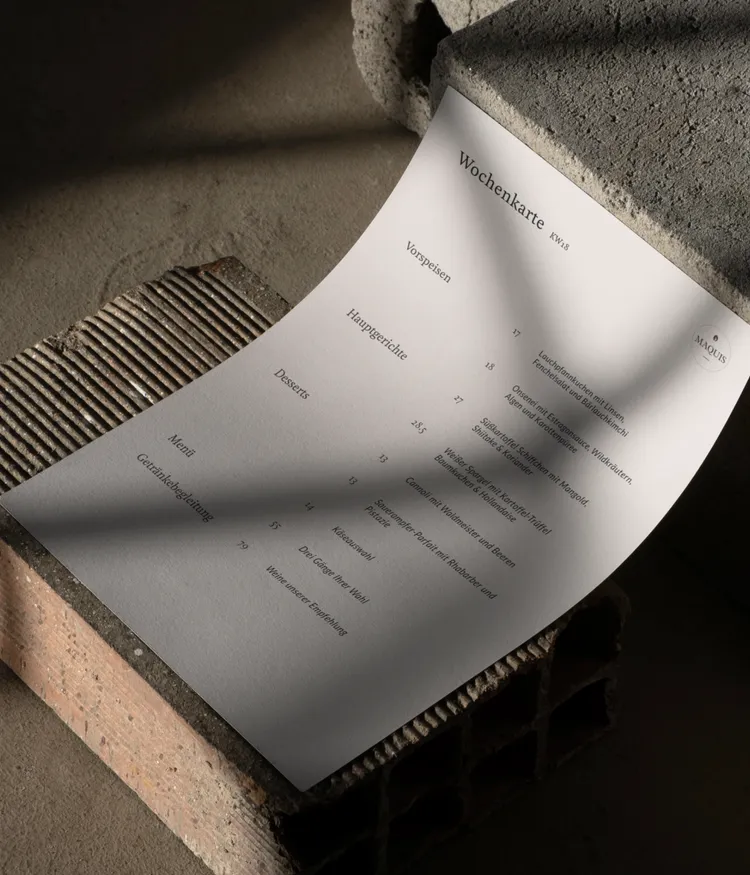
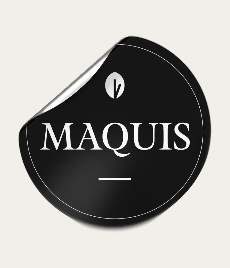
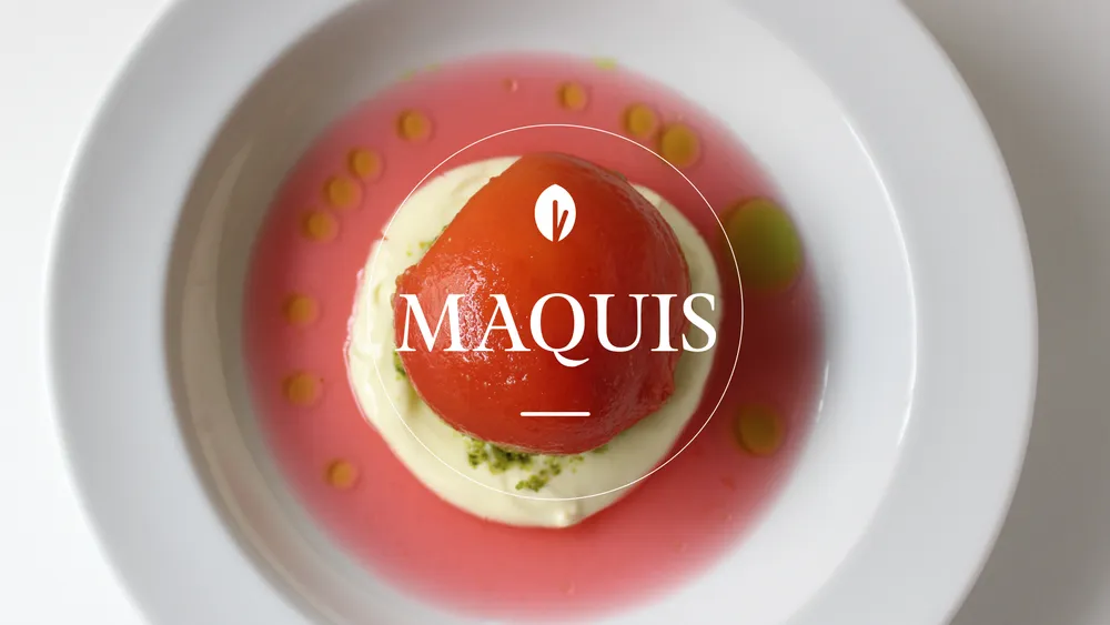
The new Maquis logo combines handwritten character with graphic precision. It stands for carefully made food and a personal atmosphere — honest, subtle and recognisable.
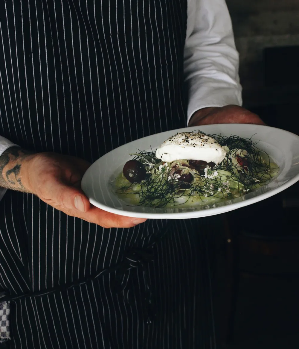
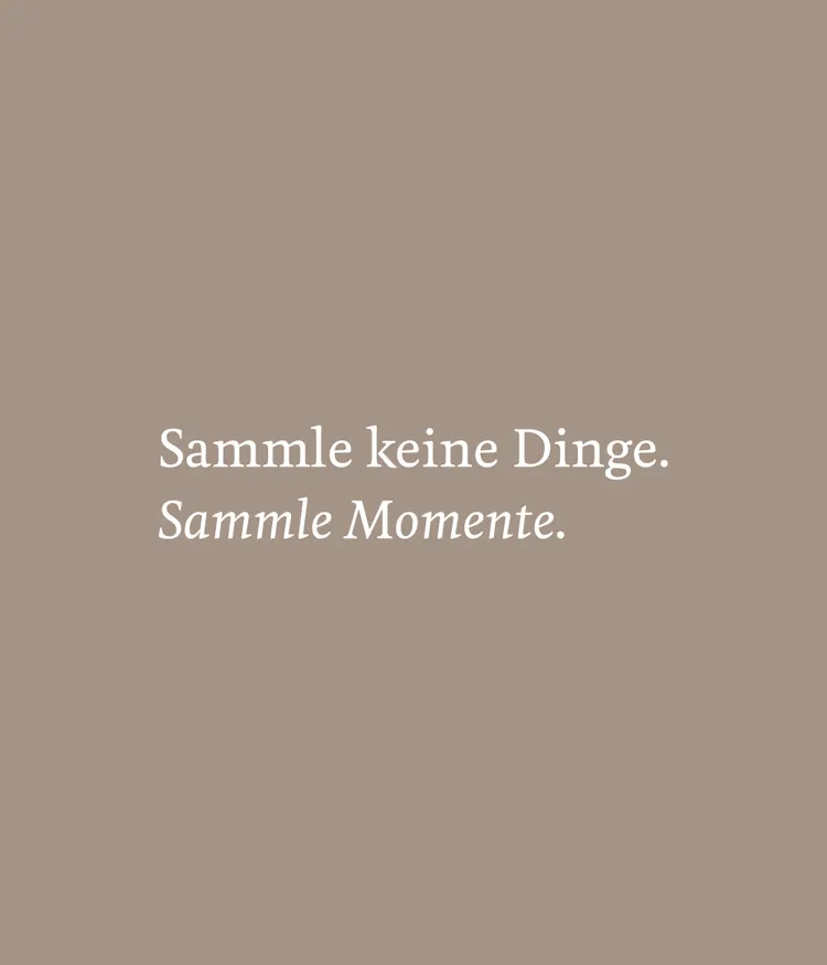
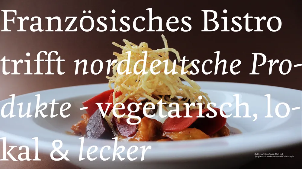
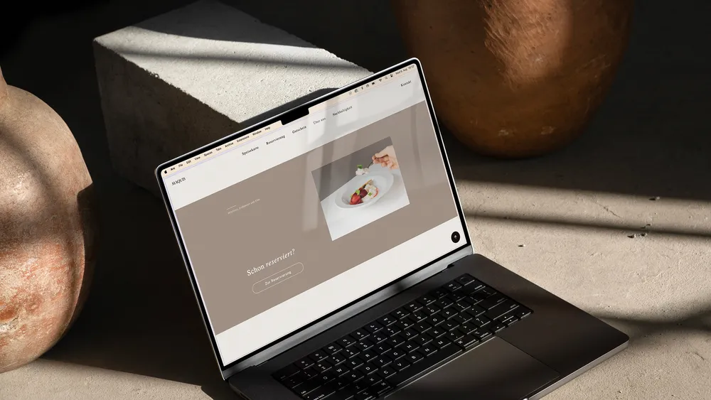
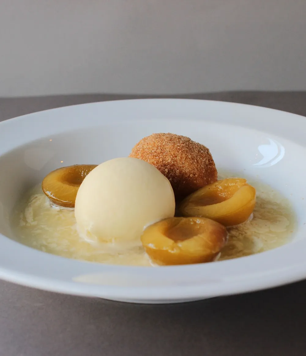
The new website is a concise one-pager: easy to navigate, restrained and visually coherent. Its imagery, colours and typography reflect what defines Maquis — a grounded place with a clear point of view and carefully made food.