Product Discovery
A few details are enough to get started. We’ll get back to you personally.
We’ll get back to you as soon as possible.
Please try again.

Our UX design agency connects product logic, user journeys, interface design and technical reality — creating websites, apps and digital systems people can navigate and teams can extend.


Product Discovery
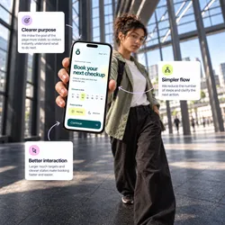
UX/UI & Prototyping
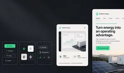
Design Systems
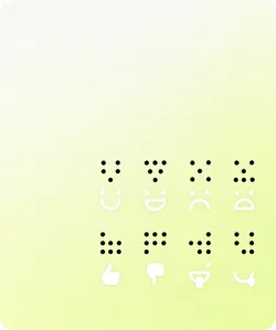
Accessibility








We turn complex products into clear journeys, useful states and familiar patterns, so people know what to do now and teams have a sound basis for what changes next.
As products grow, new features, roles and edge cases can make simple tasks feel harder than they should. People hesitate and teams start working around the interface.
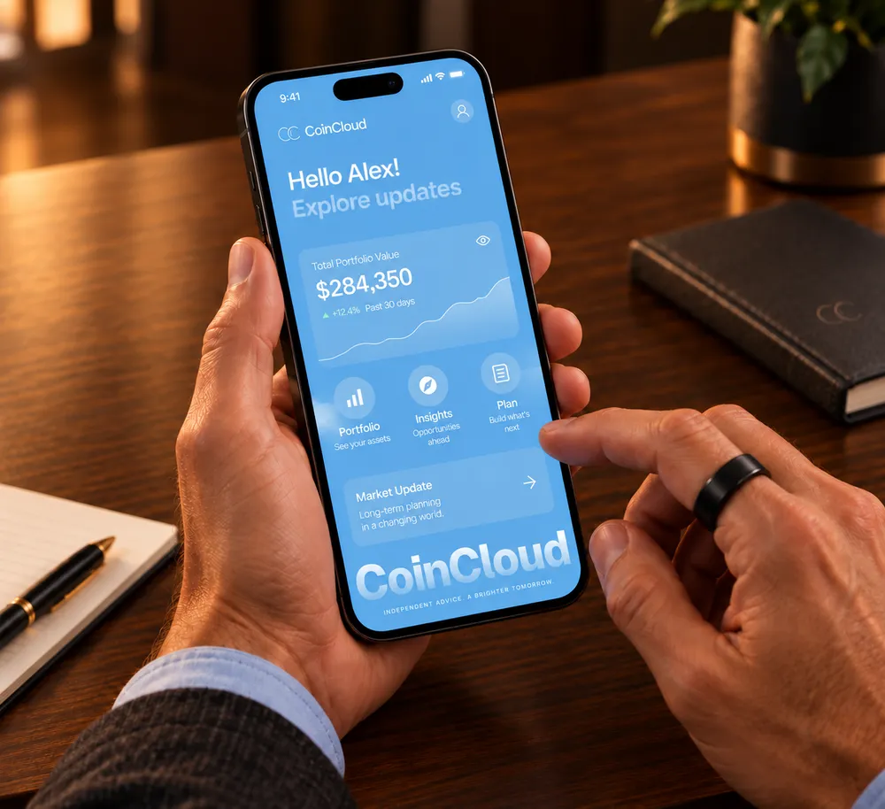
We shape the work between an idea and a screen, so the experience works for people, the team and the technology underneath.
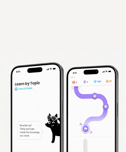
Get the people, problem and priorities in focus before the interface takes shape.
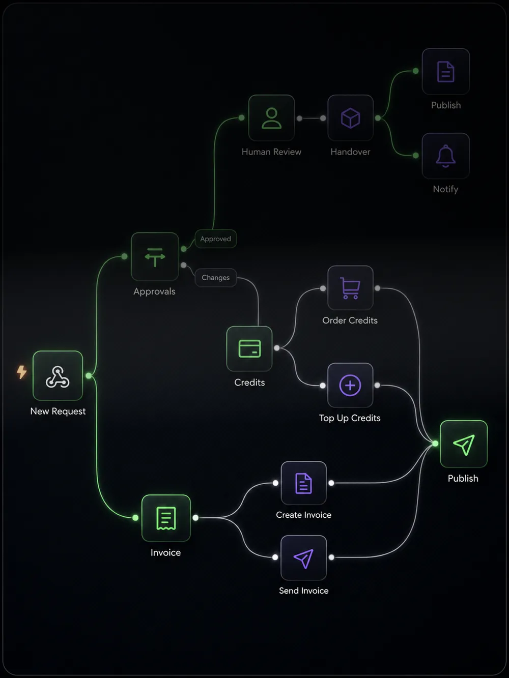
Arrange content, actions and decisions into paths that feel clear at every step.
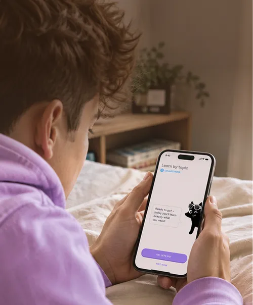
Give every screen a visual language that feels sharp, familiar and ready to use.
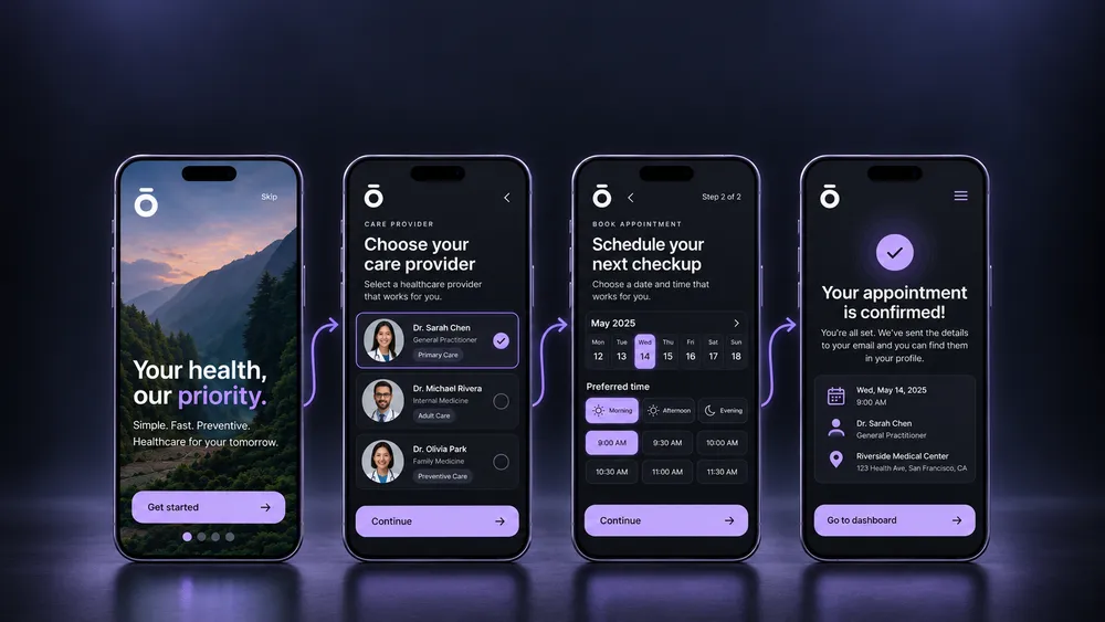
Make the structure tangible, align the team and show how the experience should move.
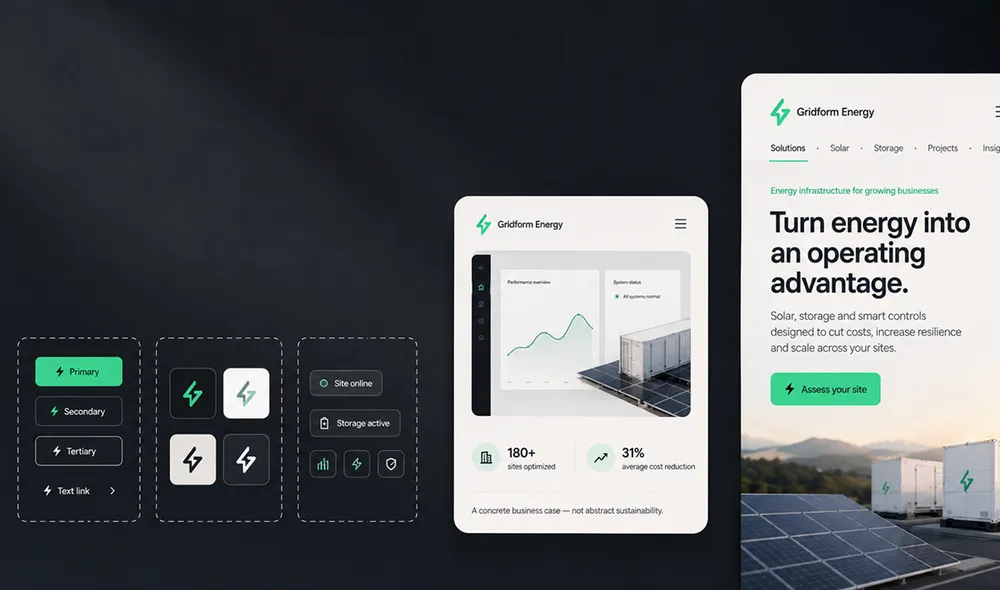
Build reusable components and rules that keep new screens consistent as the product evolves.
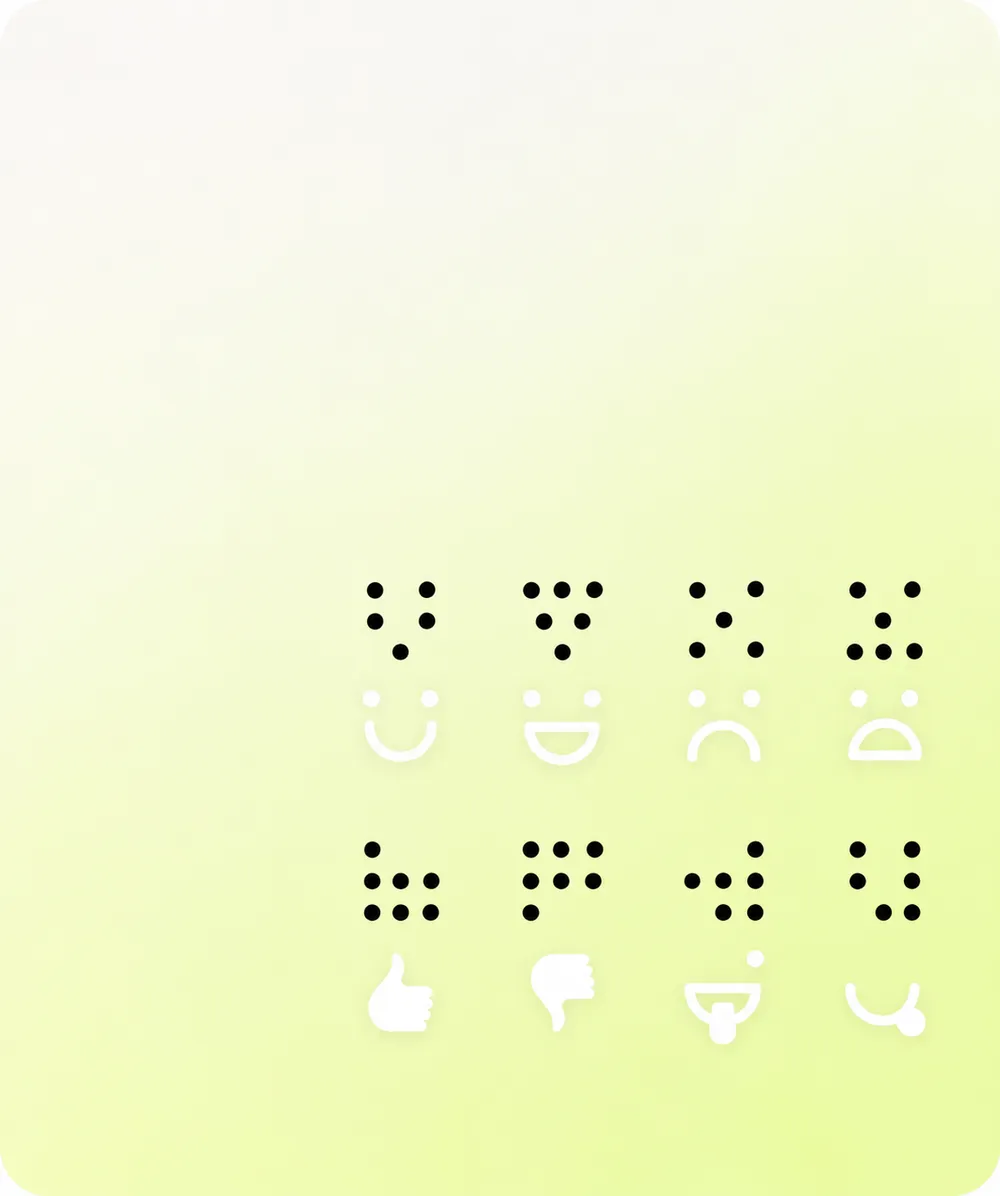
Plan content, interaction and states so the experience is clearer for more people.
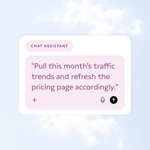
Turn a new product question into a clear next move, without asking your team to hunt through every system first.
AI can read the brief, feedback and relevant data across systems, connect the signals and prepare a recommendation. Your team reviews the result and decides what happens next.
The best interfaces make complex work feel simple because the logic behind them is clear. We map flows, roles, permissions and states before they turn into screens.
When those decisions stay implicit, new features create workarounds and teams lose confidence in what should happen next.
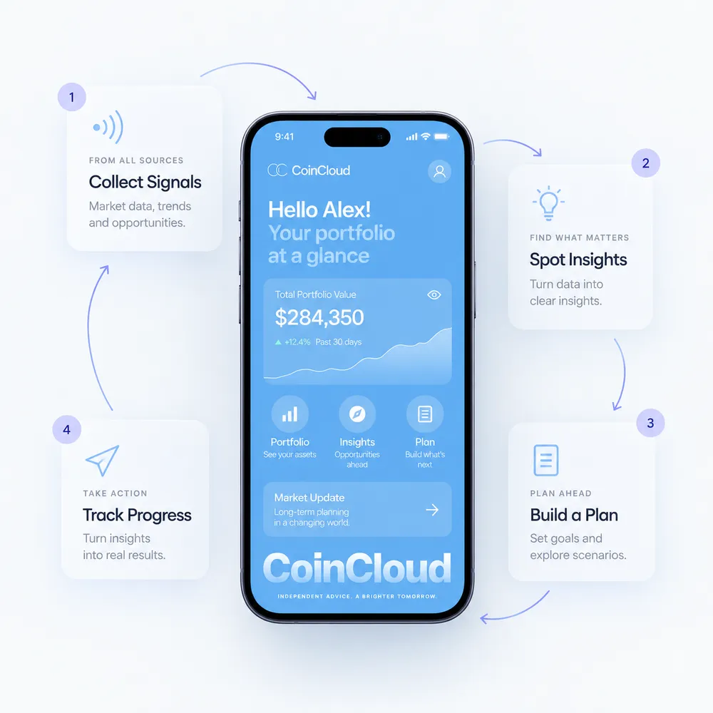
Strategy, design and development under one roof – from the first idea to everything that comes after launch.
Every page draws from the same system, so new ones stay on-brand, fast.
No paying per change, no waiting on us for every edit. You own the CMS; we just make it easy to use.

Strategy, design and tech in one connected system.
Sharp journeys. Technical delivery comes separately.

Strong build. UX depth depends on the brief.
Flexible support. Limited capacity around the work.
Close to the product. Capacity can be stretched.
We work in focused stages so decisions stay visible, the right people can shape them early and the next version has a clear foundation.
We get close to the product, the people and the task that needs to feel easier.
We map journeys, content, roles and decisions before they become screens.
We turn the structure into flows, prototypes and interface patterns the team can discuss.
We work with your technical team or carry the design into development with clear states and components.
We document the system so the next feature can build on what already works.
New features need a shared foundation. Components, patterns and rules keep every screen consistent while making the next change easier to place.
Without that foundation, new functions can make a product feel newly invented instead of part of the experience people already understand.
A clearer interface opens the next decision: build the product, strengthen the brand or connect the work behind it.

Turn a clear product experience into an app people can use and teams can keep extending.
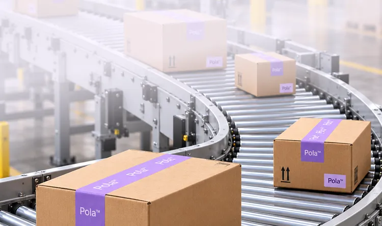
Make internal workflows easier to follow, connect and improve.
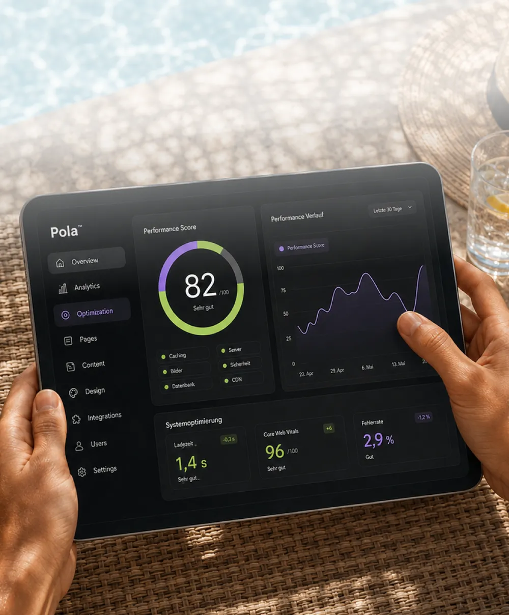
Use insight from real use to remove friction and keep improving what works.
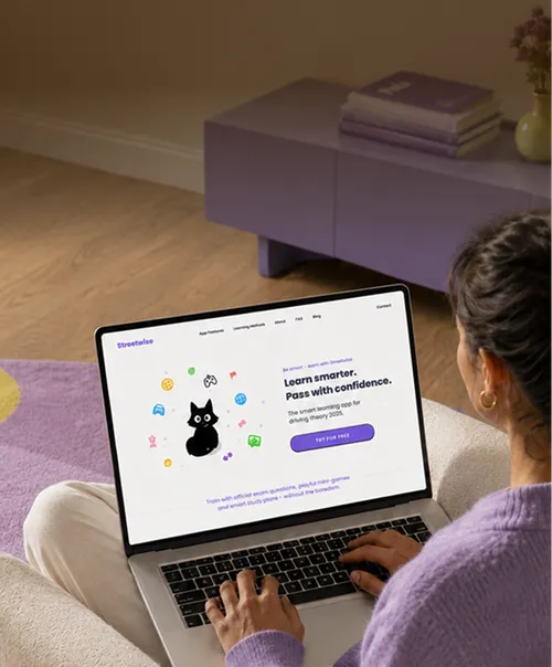
Bring the same clarity to the website where your brand, offer and journeys first meet.
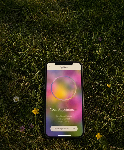
Build the frontend, CMS and integrations that make the experience real.
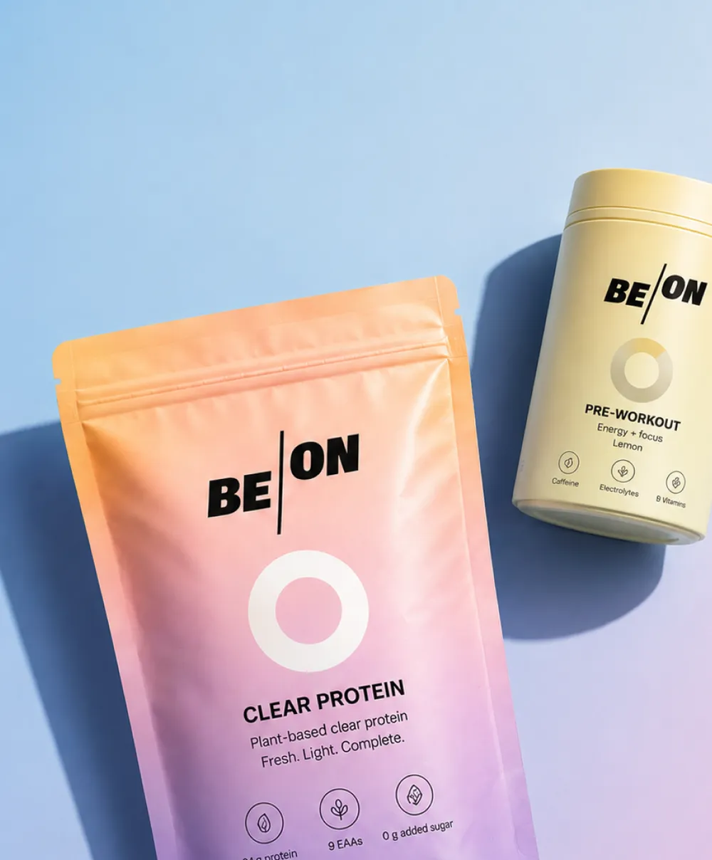
Align how the product looks, sounds and feels with the brand people meet around it.

Bring the product you have, the idea you are testing or the part that is no longer working.
We will help turn it into a focused next step.
UX/UI work combines the structure behind a product with the interface people use. We clarify journeys, flows, content, interaction and visual patterns so websites, apps or tools become easier to understand and develop.
It is useful when a product is getting more complex, a new idea needs structure or an existing interface no longer matches the way people use it. We can start with a focused flow, one product area or a broader digital system.
Yes. We can start with the parts that create the most friction or need to change next, then map how they connect to the wider product. A full redesign is not required to make meaningful progress.
No. Figma is one place where design work takes shape, but the work also covers product logic, flows, states, content, components and the technical reality of implementation.
Yes. Pola can carry the work into web or app development when that is the right next step, or collaborate with your existing technical team. The set-up depends on the product and your internal capabilities.
We consider accessibility as part of clear, considerate product design: content, interaction, states and visual hierarchy. The exact scope and any formal requirements are agreed for the specific product.
Ownership and handover are agreed at the start. We create documentation and reusable patterns to support your internal team or future partners.
Scope follows the problem, product area, people involved and the level of research, prototyping or implementation needed. After an initial conversation, we define a focused next step and a transparent proposal.