
Category
- Health & wellness
- Sports
- Technology
A few details are enough to get started. We’ll get back to you personally.
We’ll get back to you as soon as possible.
Please try again.
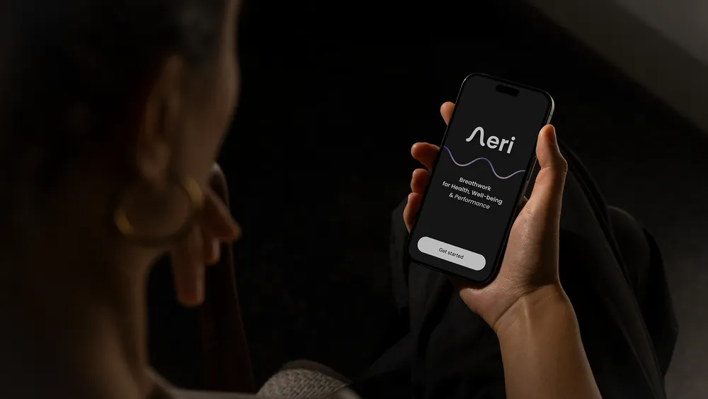
Aeri is a breathwork and meditation app — an intuitive tool for daily practice that connects body and mind. It is designed for athletes and anyone seeking calm, clarity, performance support and recovery.
For Aeri, we designed and developed a visually calm, minimalist app that guides people gently towards rest. Clear design, visual white noise and a guided onboarding experience introduce meditation and breathwork without unnecessary complexity. The app supports stress reduction, athletic performance and recovery by helping body and mind settle into a more balanced daily rhythm — one breath at a time.
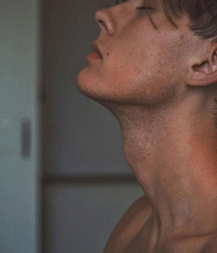
In a market crowded with busy wellness apps, Aeri created the opportunity to slow things down deliberately. The aim was not to build another breath-training tool, but a digital experience that genuinely feels unhurried. We removed everything unnecessary and designed an interface that communicates calm through clarity. Technology should support rather than overwhelm — a practical tool for presence and focus. Every decision, from structure to interaction, balanced simplicity, accessibility and emotional resonance.
Before designing a single pixel, we explored the brand from the inside out. Collaborative workshops sharpened the founding team’s vision, clarified the emotional and strategic layers of the product and defined what makes it distinct. From strategic alignment with the founder to a detailed review of every brand touchpoint, this phase gave all later creative decisions a clear and consistent foundation.
Aeri posed a particular design question: how do you translate a physical practice, deeply rooted in the body, into a digital experience that feels calm, holistic and emotionally coherent? In collaborative workshops, we defined three central values: simplicity, presence and somatic depth. They shaped a product that does more than instruct breathing exercises — it feels like breathing. The resulting minimalist, animated design supports the practice without obscuring it and gives each breath the space it needs.
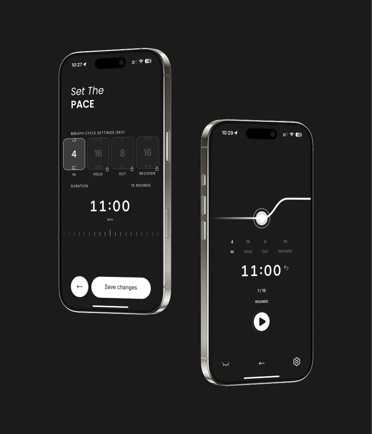

Aeri was designed for a wide range of people, from professional triathletes training for performance to those looking for support with stress, anxiety or chronic pain. The client’s close work with elite athletes informed an app that connects deep body awareness with functional clarity, while a large online community called for an open and inclusive tone. We developed a visual language that feels dynamic and grounded at once — athletic enough for performance-focused users, yet calm and accessible to everyone. Breathwork is not for a select few; it is for anyone who wants to slow down and improve their quality of life.
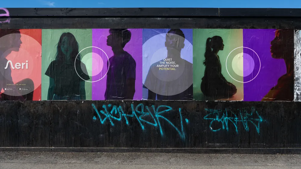
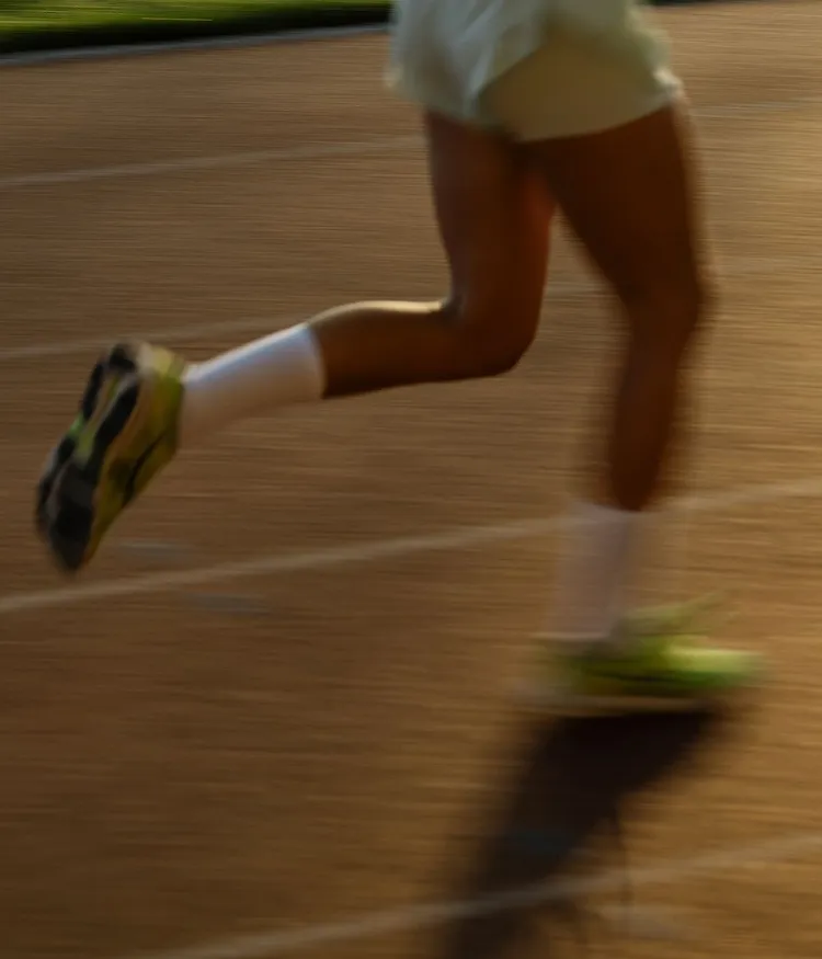
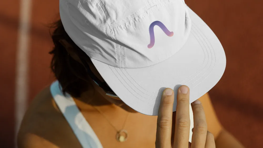
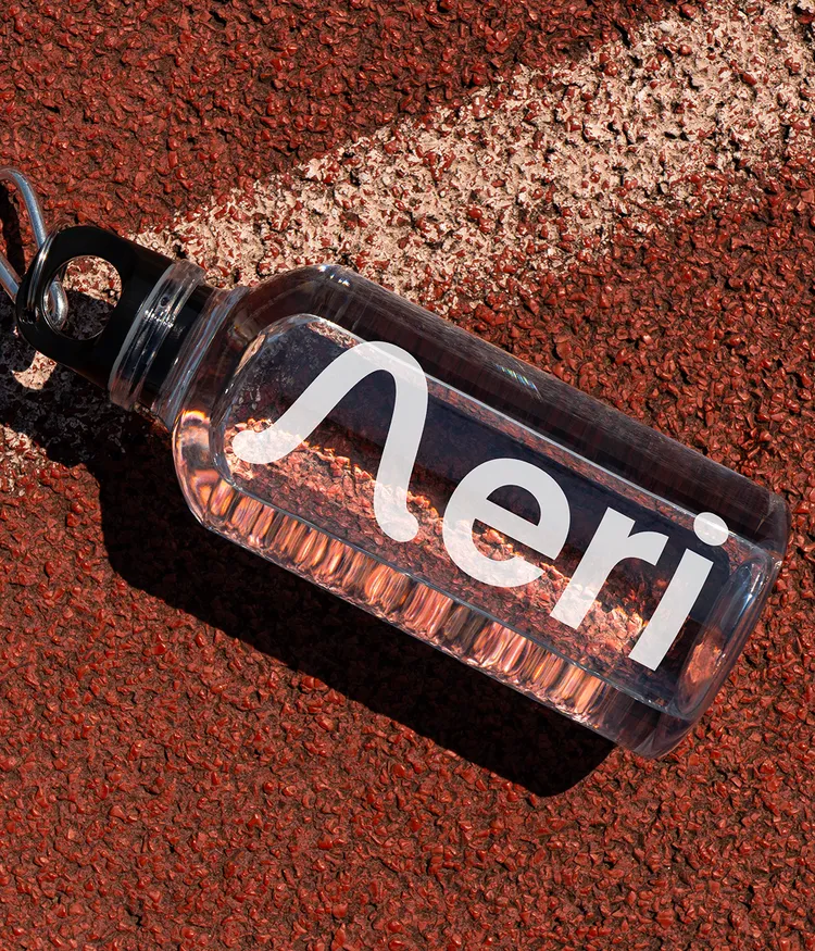
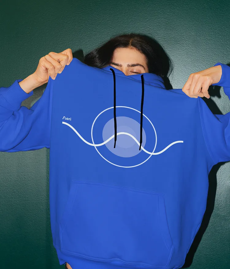
Working closely with the founder, we developed not only the tone of voice but the name Aeri itself. It suggests lightness without becoming esoteric and immediately points towards its subject: breathing. The app’s language is equally reduced. Short, clear copy replaces long explanations, particularly in onboarding, where people are introduced gently to breathwork techniques. Sessions end not with a statistic, but with an affirmation — a quiet close that lingers.
Aeri posed a particular design question: how can a physical practice, deeply rooted in the body, become a digital experience that feels calm, tangible and emotionally coherent? Collaborative workshops defined simplicity, presence and somatic depth as the central values. They shaped a product that does more than instruct breathing exercises — it feels like breathing. The minimalist, animated design supports the practice without getting in its way and gives each breath the space it needs.
Brand identity & logo
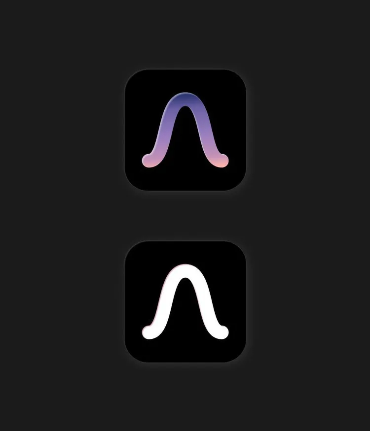
We designed a logo that is minimalist, organic and rhythmically balanced, reflecting the natural cycle of inhaling and exhaling. The shape of the ‘A’ grows from the wave-like line running through the app’s central experience as a visual guide. It captures the product’s duality: stillness and movement, clarity and emotion. More than a letterform, the Aeri logo becomes a visual metaphor for presence — simple, calm and human.
Interface & prototyping
Every interface element was reduced to what is essential. Generous space, legible typography and a clear layout create a sense of lightness and orientation, helping the mind settle instead of adding more noise.
Breath visualisation & micro-interactions
One of Aeri’s defining features is its animated representation of the breathing cycle. Instead of relying on words, we developed a motion-led system that guides people visually through each phase: inhale, hold and exhale. This body-focused signal makes the experience tangible and alive rather than simply understandable.
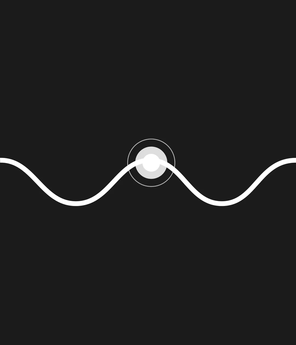
Aeri was designed to be more than functional; it creates an experience. Every touchpoint supports a calm, uninterrupted state of flow. From onboarding to guided sessions, the app provides effortless guidance and helps people stay focused. Image, sound and motion work in sync to lead without distracting. The result is an intuitive breathwork tool that almost disappears — because the best tools leave room for what matters.
UX flow & onboarding
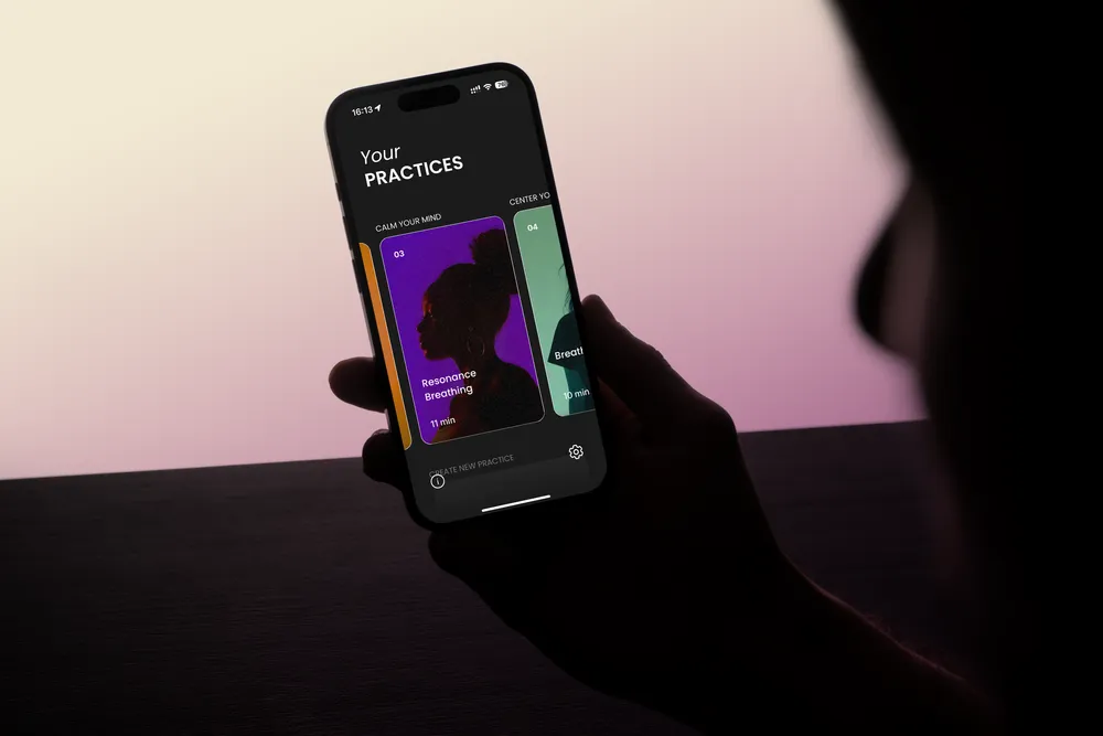
The user journey is deliberately calm and clearly structured, from the first interaction to daily practice. Onboarding introduces the foundations of breathwork gently, explaining which posture supports relaxed breathing and how the diaphragm and pelvic floor can guide breath into the abdomen and chest.
Motion & sound integration
Micro-animations and a tailored audio engine accompany each breathing exercise through a minimal interface. Soundscapes and transition tones synchronise with the breathing rhythm to create a multisensory experience.
Personalisation
People can choose from six visual themes designed around different moods and times of day: Pure Black, Cool Horizon, Ocean Sand, Violet Pop, Lavender Twilight and Sunset Sorbet. Pitch can be adjusted, and haptic feedback can be switched on or off for silent use. Further personalisation options are already planned.


