Category
- Technology
A few details are enough to get started. We’ll get back to you personally.
We’ll get back to you as soon as possible.
Please try again.
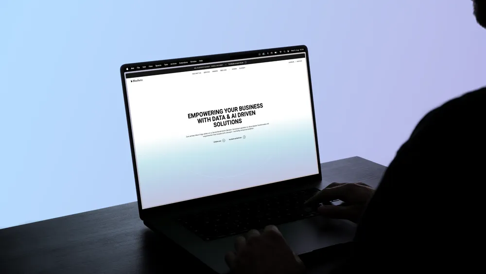
Blueforte is a data analytics and AI consultancy that helps companies make data-informed decisions and shape their digital transformation.
For Blueforte, we evolved the brand strategically through clearer positioning, a new brand architecture and a sharper visual presence. That foundation informed a new website presenting Blueforte as a modern, capable and forward-looking consultancy. We led the complete process, from concept and UX/UI design through to technical implementation.

Blueforte works deep inside data, strategy and business processes. The challenge was making a brand visible when much of its strength operates behind the scenes. We wanted to position Blueforte as a modern authority that connects technical depth with strategic thinking. This called for a website that communicates clarity and expertise, together with a brand that feels credible without becoming remote. The relaunch created the opportunity to sharpen Blueforte’s identity and build a digital presence shaped by trust, knowledge and ambition.


Before thinking about design or code, we mapped Blueforte strategically with the team. What defines the brand? What motivates the people behind it? And how can a complex B2B service become tangible online? Interactive workshops and analysis sharpened Blueforte’s DNA, balancing commercial clarity with human proximity. The aim was a strategic foundation visible at every touchpoint: dependable, capable and forward-looking. This phase gave the new brand identity substance across tone of voice, visual language and user journeys.


Blueforte operates in a complex market: data-led, fast-moving and often abstract. Our task was to develop a brand strategy that makes expertise tangible and builds trust. Workshops identified the core qualities of the brand: clarity, partnership, capability and a progressive mindset. This strategic basis defines not only what Blueforte does, but how working with the company should feel. The resulting brand foundation balances relevance, expertise and humanity and guides every design and communication decision.
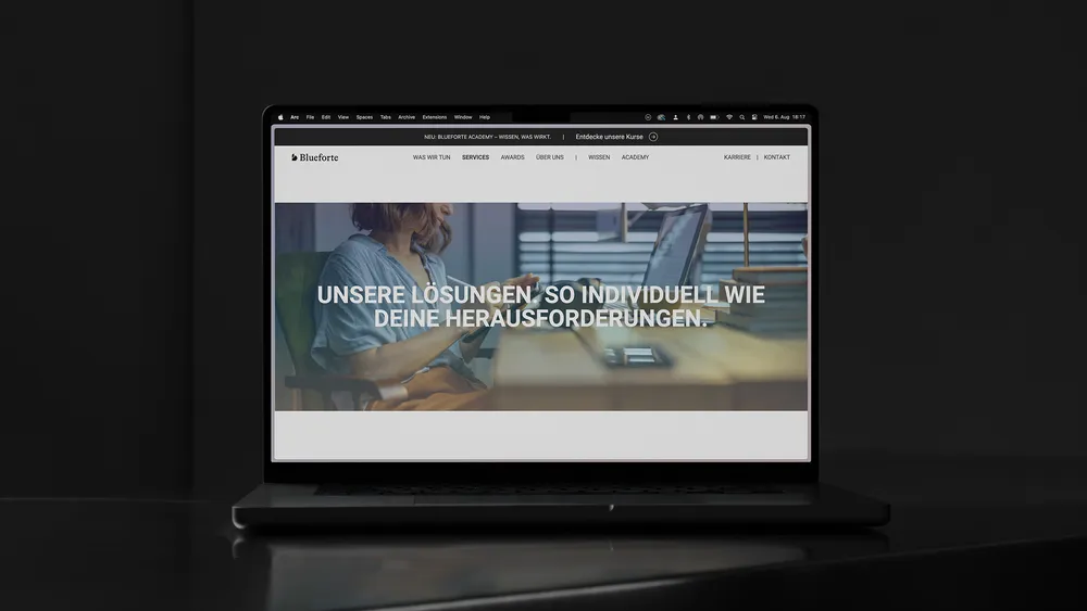

Data sits at the heart of Blueforte. It is complex and strategically valuable. The challenge was to create a visual language that does more than organise information: it should build trust and connect analytical depth with clarity, precision and modern accessibility.
The new design system translates these principles into a clear visual language through a distinctive logo, calm colour palette and structured layouts with room for content. Technical, yet human. Serious, never rigid. The identity supports Blueforte’s role as a dependable data partner for organisations of different sizes, from mid-market companies to larger groups.
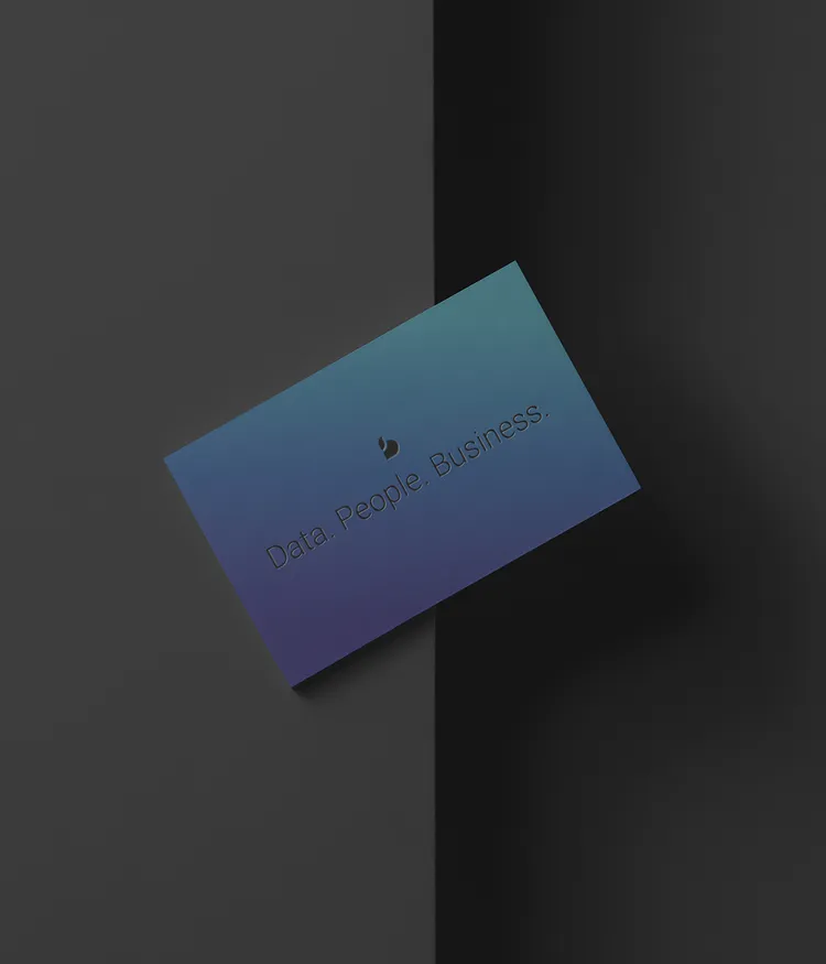
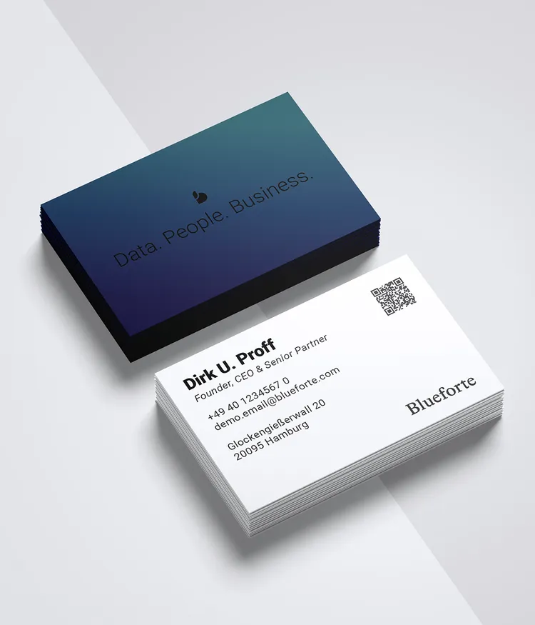
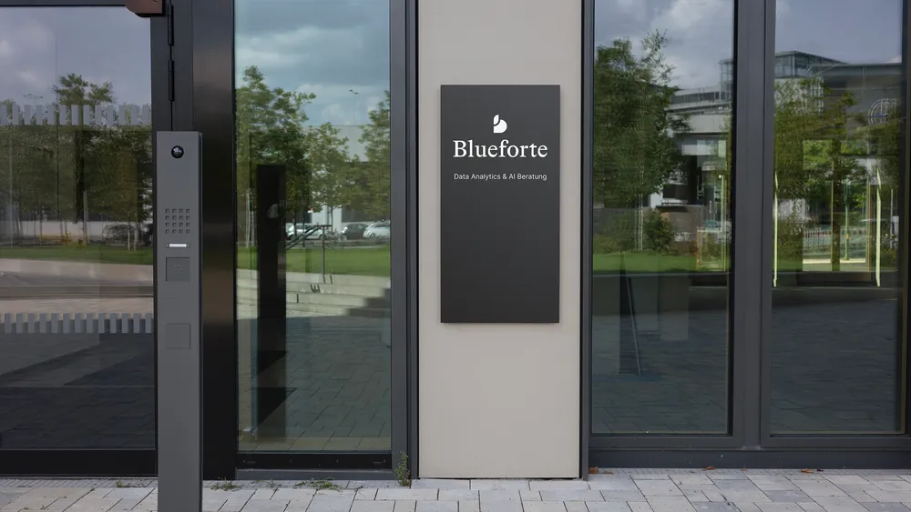
To extend the existing logo, we developed a new brand symbol: an abstract ‘b’ that feels familiar and distinctive at once. Its organic shape reflects the iconic simplicity associated with major technology brands, while a leaf-like upper arm represents Blueforte’s commitment to sustainability. The symbol works independently from the wordmark, adapts easily across formats and creates a clear anchor in digital contexts. It stands for clarity, adaptability and responsibility, translating the core of the brand into a restrained, forward-looking form.


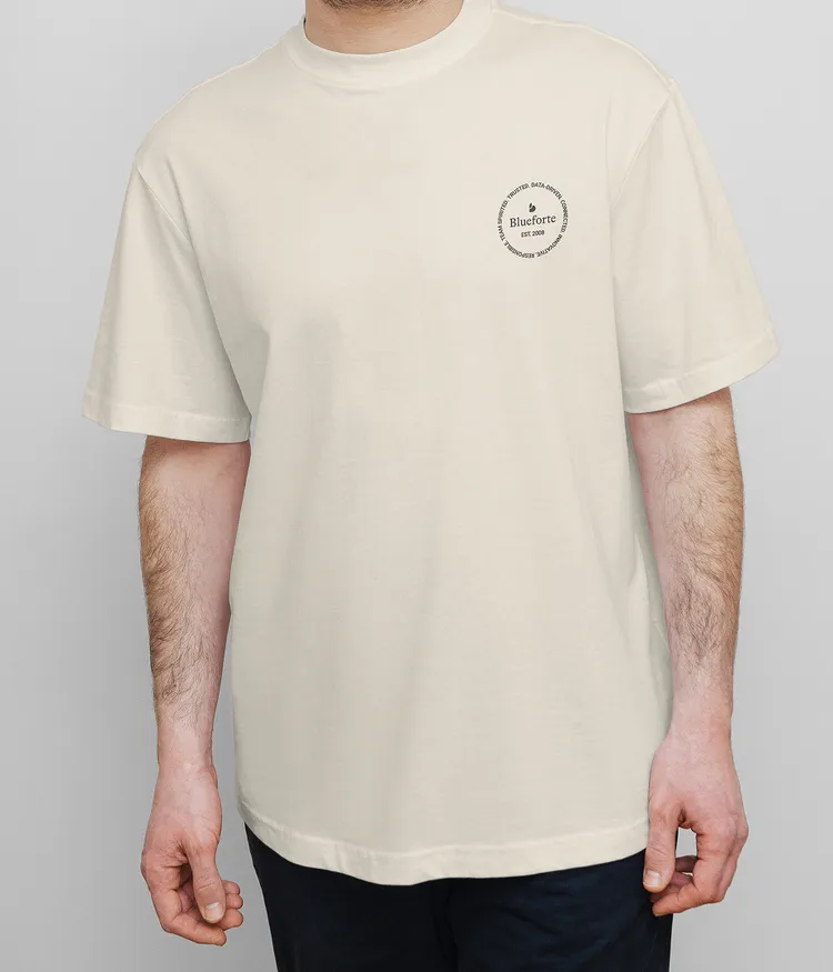
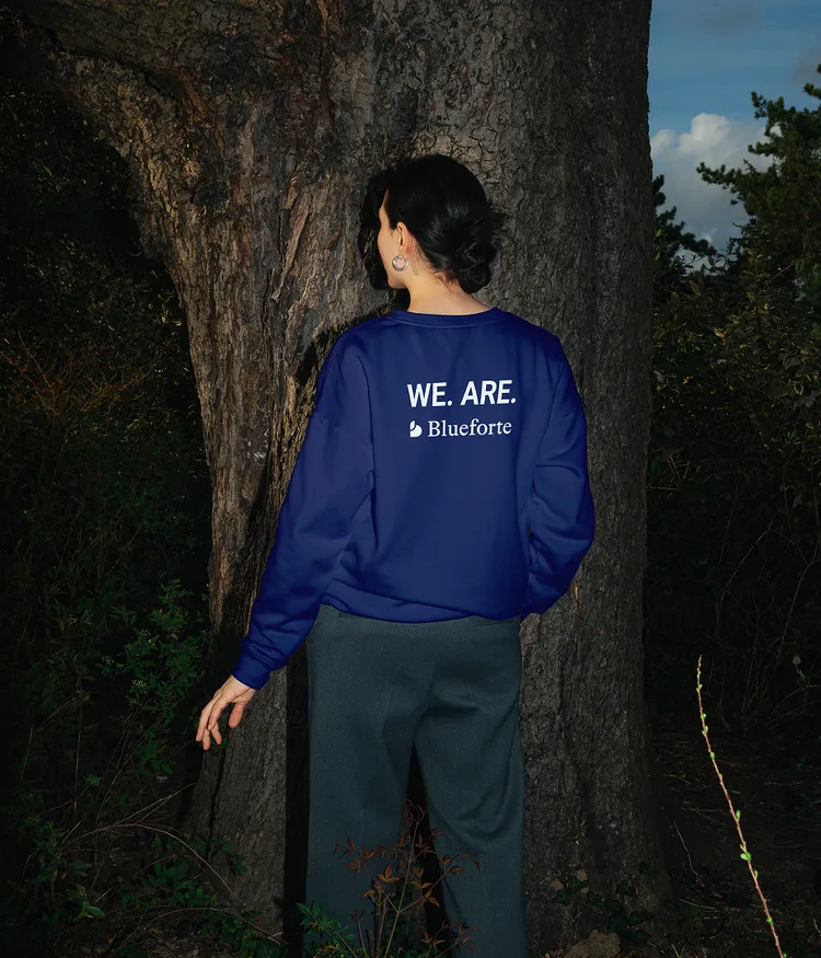

Blueforte combines deep data expertise, strategic thinking and collaborative consulting. The language needed to do the same, without buzzwords or empty claims. The new tone is clear, structured and direct. It speaks to decision-makers and specialist teams, remains accessible without oversimplifying and demonstrates expertise without getting lost in jargon. Together, we developed a voice that says what it means: factual but not dry, capable without becoming distant. From the central claim and navigation to key website copy, this tone now runs through the complete brand experience. Language becomes a strategic tool for trust and orientation.
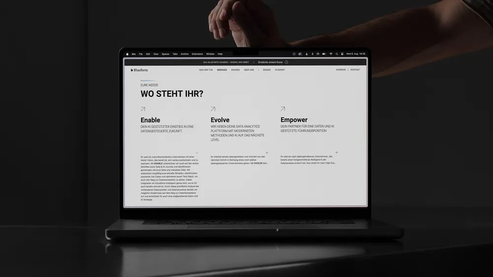
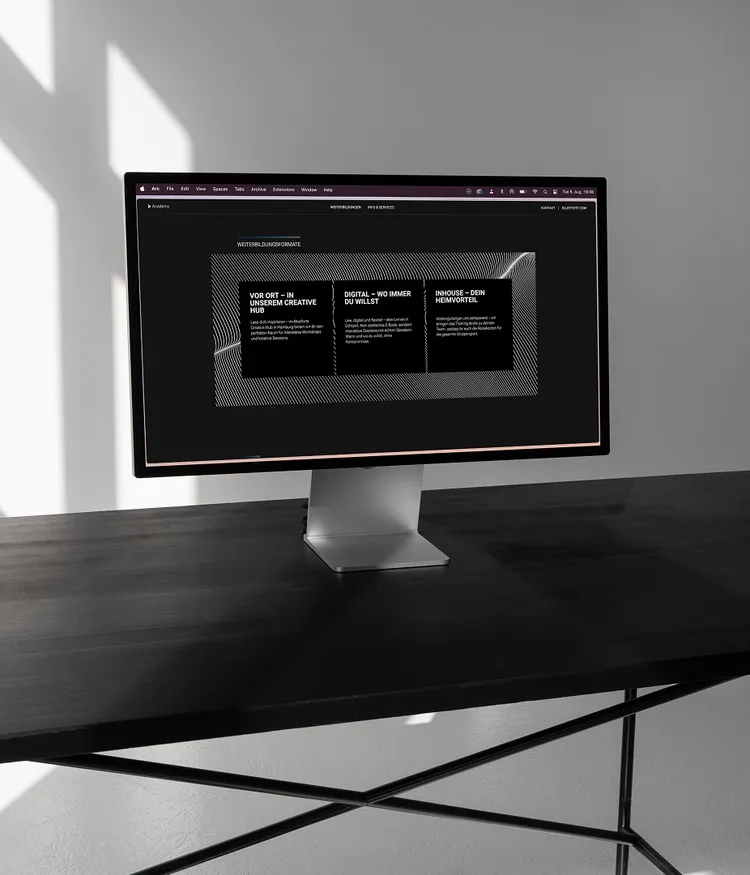
The new Blueforte website needed to be more than a digital calling card. It had to make the company’s broad offer and expertise understandable, attractive and accessible. We created a clear UX architecture that makes complex content easier to navigate, supported by a clean interface, considered micro-interactions and a consistent design system. The site was also implemented on a sound technical foundation: modular, extensible and centred on real user needs. Complexity becomes easier to understand, and information becomes a coherent expression of the brand.


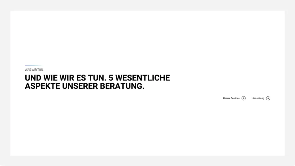
For Blueforte, we designed an interface that uses visual restraint deliberately. Generous space, clear typography and calm page structures create overview and focus. The digital environment provides orientation rather than distraction. Distinctive statements and concise headlines build in as people scroll, adding presence and communicating the brand’s point of view through both motion and composition.
UX flow
The new Blueforte website guides people intuitively through content, services and offers. Clear structures, considered navigation and interactive details create orientation and a smooth experience. The site does more than inform: it builds a path from the first interaction through to making contact.
The pulse of the brand
Moving from deep Night Blue to clear, vivid Ocean Blue, Blueforte’s signature gradient captures the brand’s forward momentum. It is more than a decorative device; it becomes a symbol of movement and change. Often fading gently into the white background, it recalls motion blur as a visual expression of speed and continual development. Used as a subtle overlay on imagery or a fine line beneath headlines, the gradient anchors content quietly in the brand. Combined with sport-led imagery, it creates a presence that feels capable, clear and in motion.