Resilia
For RESILIA, we created a distinctive brand and a digital platform that brings research, civil protection, technology and public education into one coherent identity.
From the logo, colour palette, typography, illustrations and photography to the language and website, we built a system that makes a complex research project easier to understand and explore. We shaped the copy, designed and developed the website, and populated it with the core content for launch.
One identity for what must work together
RESILIA brings together security research, fire services, disaster research, artificial intelligence, communications, psychology and public education. The challenge was to unite that breadth without hiding the project’s complexity or overwhelming the people it wants to reach.
The hub speaks to citizens, emergency services, public authorities, critical infrastructure operators, researchers and decision-makers. Its identity therefore needed to combine scientific credibility with clarity, openness and a sense of practical relevance.
The opportunity was to turn an extensive research programme into a platform that quickly makes its purpose clear: understand risks, practise action and strengthen collaboration.

Many perspectives. One shared story.
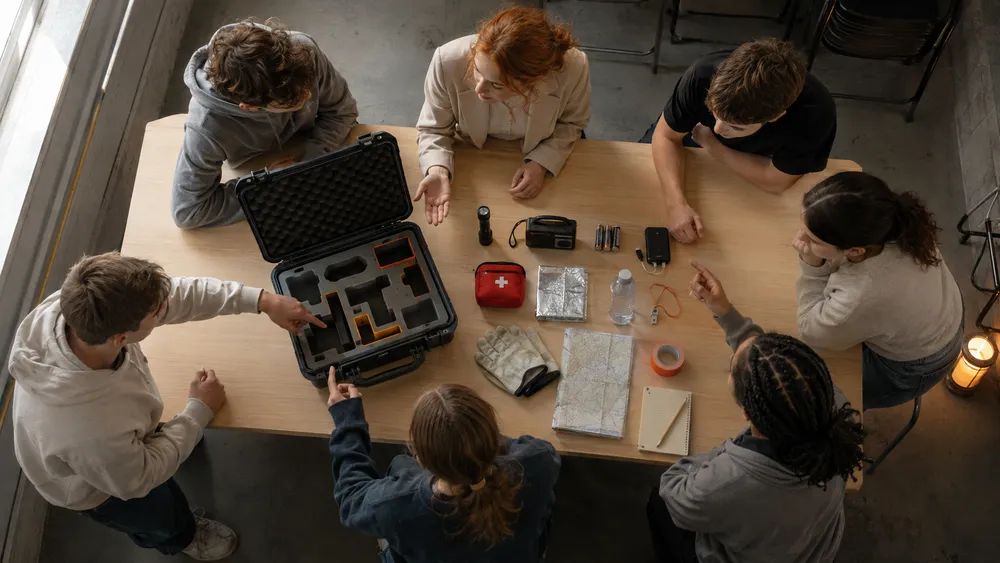
Before the logo, colour system or website took shape, we had to understand what holds RESILIA together. The project brings institutions with different roles, specialist vocabularies and expectations into one network — from operational emergency response to academic research.
We organised the project’s central themes and translated them into a clear communication structure. Three questions guided the work: What does societal resilience mean in practice? How can research become something people can experience? And how do three laboratories — in Berlin, mobile and digital — form one connected Innovation Hub?
This groundwork gave the brand, language and website a shared direction. Each later decision could grow from the same core idea.

Resilience starts with shared understanding
RESILIA deals with crises, uncertainty and complex risks. The brand needed to take those subjects seriously without relying on fear. Instead, it focuses on preparation, practical capability and the strength of working together.
We positioned RESILIA as an open Innovation Hub where research becomes tangible through training, scenarios, digital applications and shared experience.
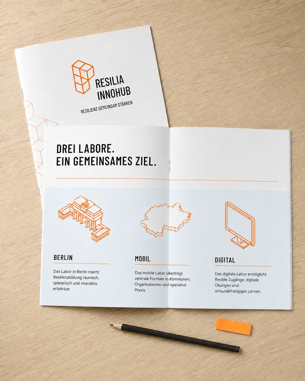
The three connected resilience laboratories provide the central structure. Berlin offers a permanent place for encounters and training, the mobile lab brings formats into local contexts, and the digital lab makes learning and exercises accessible from anywhere.

Making safety visible without relying on warning signs
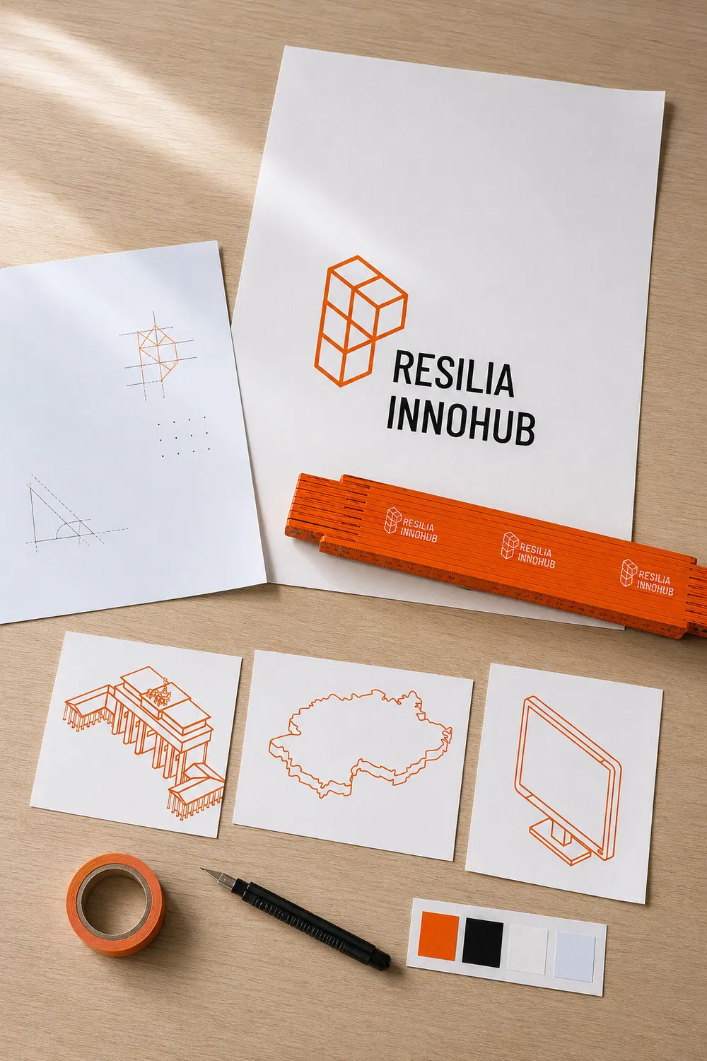
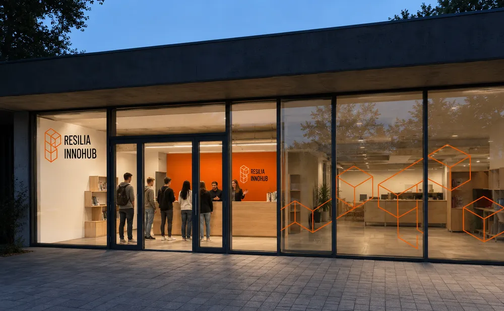
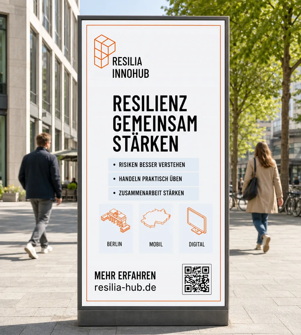
RESILIA’s visual identity brings together clarity, technical precision and human accessibility. A strong orange accent creates recognition and orientation; black, white and a pale blue keep the system calm, legible and spacious enough for complex information.
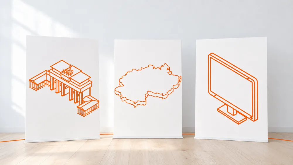
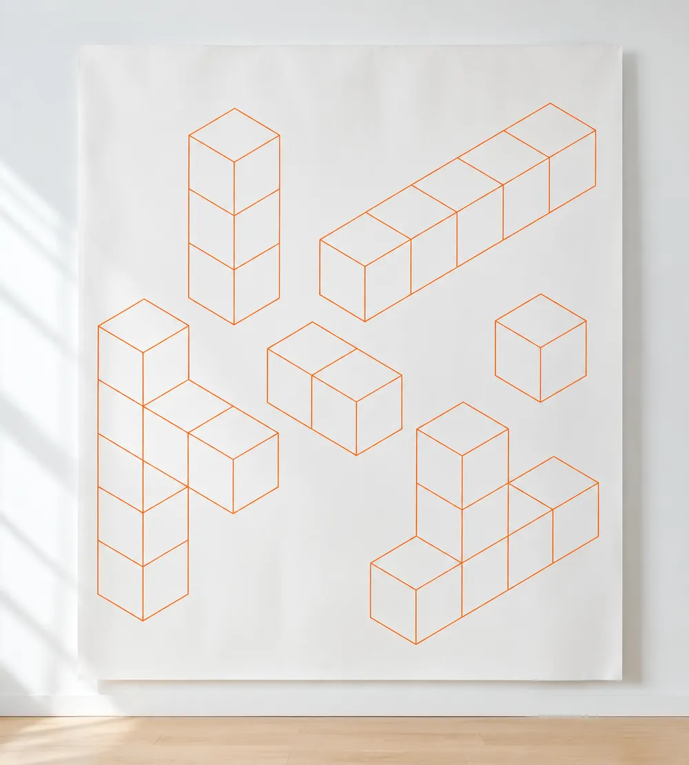
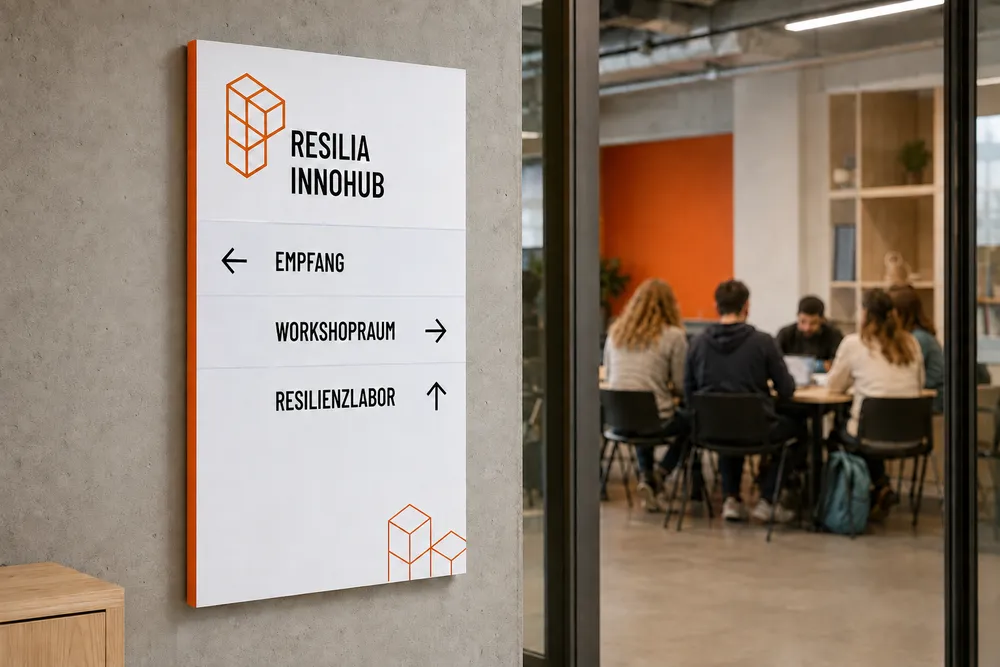
A modular system of shapes, lines, icons and isometric illustrations translates the project’s different layers into one visual language. The Brandenburg Gate represents the Berlin lab, the outline of Germany the mobile lab and a screen the digital environment.
Photography adds the human and societal dimension: everyday life, emergency services, public spaces, research and collaboration. Together, these elements create a brand that feels credible and serious without becoming distant.



A stable core with room to adapt
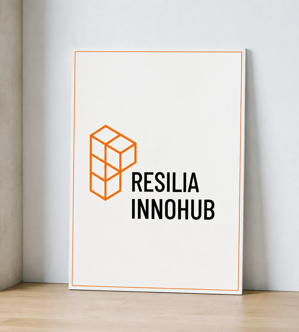
The RESILIA logo forms the calm, recognisable centre of the identity. Its reduced construction works across digital and printed applications and is supported by a flexible graphic system.
Geometric elements connect, shift and form new constellations across layouts. The system gives the brand enough structure to remain consistent while accommodating different laboratories, audiences, formats and stages of the research project.
Colour, typography, illustration and photography follow the same principle: clear enough to orient, flexible enough to keep developing.


Precise for research. Clear for wider audiences.
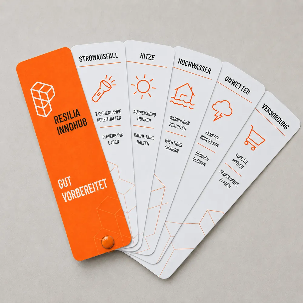
Terms such as societal resilience, risk literacy and cognitive social simulation belong to RESILIA’s specialist context. On the website, they still needed to be understandable to people without an academic background.
We developed a voice that remains precise but moves quickly towards concrete situations, decisions and possibilities for action. What happens during a power outage? How does communication change under pressure? And how can communities, authorities and organisations work together more effectively?
Headlines, introductions and concise functional copy guide people through the project. Deeper content then creates space for the research, the consortium and the professional context — without turning every first encounter into a technical paper.

A research platform designed to unfold over time
RESILIA runs from January 2026 to December 2029. Its website therefore needed to be more than a static presentation at launch. It required a structure that can accommodate laboratories, formats, research findings, partners, downloads and new ways to participate as the project develops.
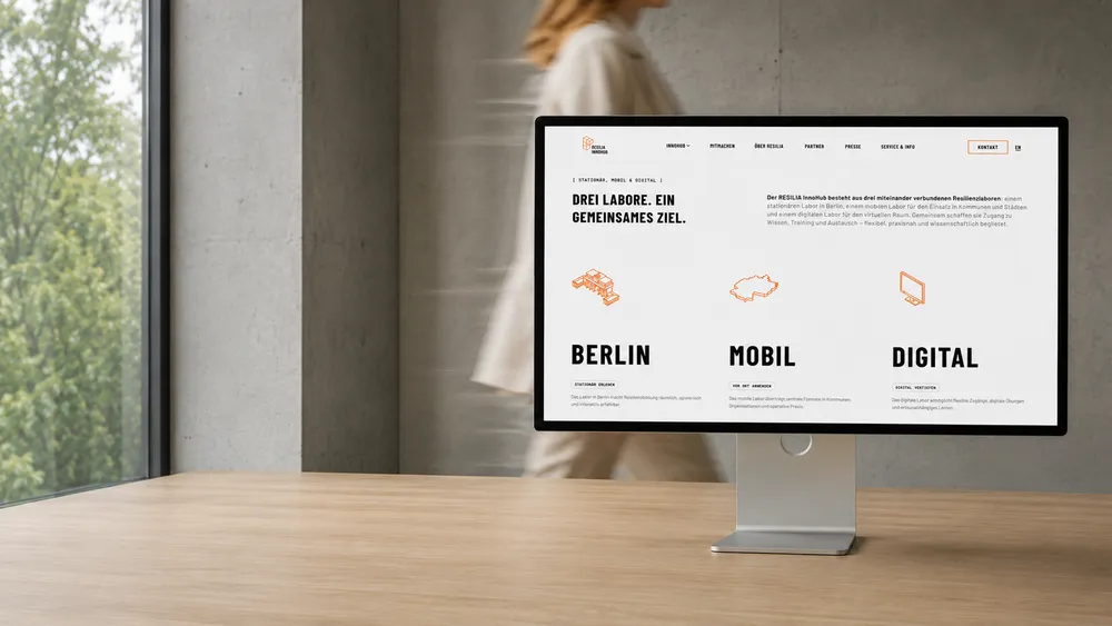
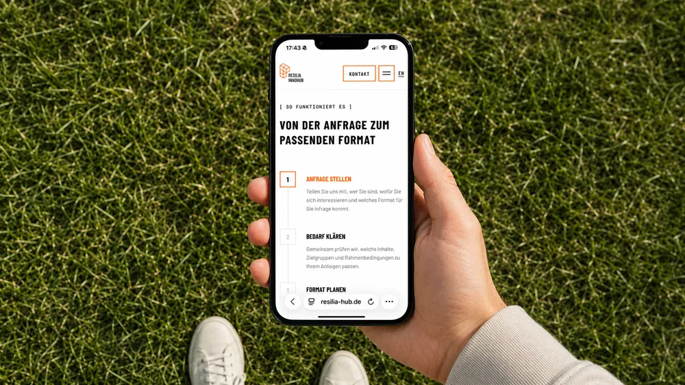
We designed and developed a modular bilingual website that explains the Innovation Hub quickly, then opens different paths into the detail. The three laboratories provide recurring orientation, while audiences, areas of impact, partners and research content each receive a clear place within the wider system.
Bold accents, large typography, motion, illustrations and photography give the extensive content rhythm. Reusable components keep future additions coherent rather than turning every new topic into a one-off page.
From first orientation to deeper research
The website guides very different visitors from the same opening question: What is RESILIA, and where might it connect with my work or everyday life?
The homepage introduces the Innovation Hub in a few clear steps. From there, dedicated routes lead to the three laboratories, target groups, consortium partners and research context. Citizens find different entry points from fire services, municipalities, researchers or critical infrastructure operators, while the platform still feels like one connected project.
Three laboratories as one navigation system
Berlin, mobile and digital are more than three offers. They form the central organising idea of the website. Recurring illustrations, colours and copy patterns explain their different roles and show how they complement one another.
A platform still in motion
The resilience laboratories and their programmes are still being developed. The website communicates that status openly while creating space for future scenarios, training formats, digital tools and research findings. The platform can evolve with RESILIA instead of being finished before the real work begins.


Bring research, communication and design into one system
When many disciplines need to speak with one voice, we shape the brand, content and digital platform that hold them together.