Why is a website important for businesses?
- February 5, 2026
- Anna


Today, a company website is not just a digital business card. It’s the place where people check you out, compare you and get a sense of whether you’re reliable.
We’ll show you what goes wrong without your own website, how a site actively makes decisions easier – and which building blocks really support trust, visibility and inquiries.
No buzzwords, but clear examples from our work at Pola.

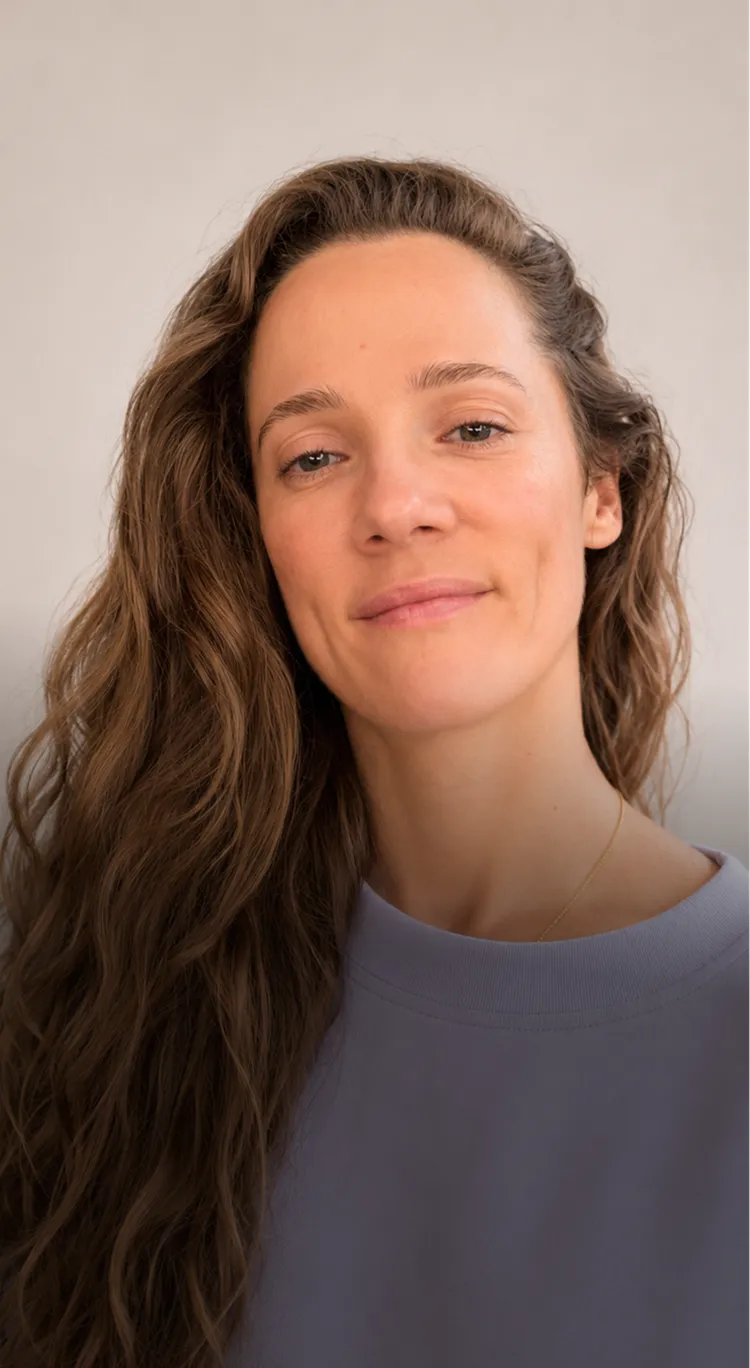
Anna
Strategy & Creative Direction
Role
Strategy & Creative Direction
Focus
Brand strategy, visual identity, UX/UI design and digital brand systems
Background
Photorealistic painting, experimental photography and brand and digital design
Perspective
Shaped by London’s galleries, cafés, shop windows and creative diversity
Approach
Precise, conceptual and with a strong eye for detail
The first impression is formed before the first conversation
You’ve probably noticed it yourself: When someone recommends you, almost always the same reflex follows. Not a call first, not a message first – but a quick check in the browser.
We see this constantly in projects. Today, a recommendation is rarely the end of a decision, but rather the beginning. People are looking for a sense of security: “Do you really exist?”, “Is this a good fit for what I need?”, “Can I afford to get involved with this?” And these questions are answered within seconds – by what can be found online.
The first hurdle isn’t your offering
Companies often think: “Our work speaks for itself.” It does – but only for people who already know you. For everyone else, your website is the first proof that your offering not only exists, but is also reliably organized.
Here’s our first perspective, which we at Pola repeatedly see as crucial: The website is your “Decision Room”. Not your shop window. Not your portfolio folder. But the room where decisions are made, because that’s where context is created.
In practice, this means: If your website is unclear, friction arises. If information is missing, the other person goes back to what’s faster: Google results, platform profiles, review portals or the next provider.
And something else has changed: The benchmark is no longer “having a website”, but “having a website that feels calm and coherent”. People judge not only the design, but also the structure, language, loading time, readability, mobile usability and whether you really seem reachable.
We often see this: companies invest a lot of energy in social media or networking events – and are surprised that interested people still don’t make inquiries. Often, the reason is that after the initial contact, there is no stable place that continues the story in a clear way. That is exactly the job of a good website: it picks up the impulse and carries it forward – without pressure, but with clarity.


Without your own site, others tell your story
If you don’t have your own website, you still have a digital presence. Just one that you don’t really control.
Then Google snippets, business directories, map profiles, old PDFs, social media posts or comments tell the story. Sometimes they contradict each other. Sometimes they are outdated. And sometimes they create an image that you would never draw that way yourself.
What practically happens without a website
We have often seen this in practice: A company is strong in its field, but online there are only a few scattered signals. Opening hours here, phone number there, service description somewhere, but no common thread. To you, this may feel like “a little untidy” – to your potential customers, it feels like a risk.
This is our second fresh perspective: Without a website, you are not “offline”, but “managed by others”. Platforms are helpful, but they are not your home. They decide how content is displayed, which elements get priority, and how easy it is to find you at all.
On top of that: Social media profiles are fleeting. A post from last week is far away after two days. A highlight quickly feels like a stopgap. And when algorithms change, you feel it as a loss of reach – without necessarily having done anything wrong.
Of course, you can also get orders without a website. But you often pay for it with time: more explanations, more follow-up questions, more misunderstandings, more drop-offs.
Our method: The “Single Source of Truth” check
When we at Pola analyze an existing online presence, we don’t start with design. We start with a very simple test: Can a stranger confidently answer three things within 90 seconds – what you do, who it’s for, and how to take the next step?
If the answer is “not clearly”, the problem is rarely the offering. It lies in a lack of consolidation. A website is exactly what it is there for: a place that brings information together, prioritizes it, and tells the story in a way that means trust doesn’t have to be fought for.
And yes: This also applies to small businesses, local offerings, consultancies, initiatives or impact projects. Especially there, trust is often the most important currency – and it emerges when you become visible and consistent.
People assess trust in many small leaps
When we observe user behavior, we rarely see a linear journey. People jump. They arrive via a search, click a subpage, are briefly away, come back, check “About us”, scan references, look for an imprint, open the contact page – and only then does an inquiry arise.
A good website is built for this. It takes the restlessness out of the process.
Touchpoints need a clear landing
Here is our third perspective: Your website is not a channel – it is the landing strip for all channels. Whether it is a recommendation, social post, newsletter, press article or QR code on a business card: Somewhere, the impulse has to land without breaking apart.
To make this work, you do not need long texts, but a clean information architecture. You do not lead through pressure, but through orientation.
In practice, this means:
First: Every page should have a clear purpose. A homepage is not there to explain everything, but to set the framework and open up paths.
Second: Trust rarely arises from a claim (“We are the best”), but from comprehensible details. Concrete examples, clear language, genuine insights into ways of working, team, values, and a realistic view of limitations.
Third: The next step must be easy. Getting in touch must not feel like a form marathon. At the same time, it must be designed so that you receive good inquiries.
Our method: The “Three-Question Funnel”
We use a simple structure in many projects that has proven effective across very different industries:
- What do I get here? (Result and benefit in one sentence)
- Why should I believe you? (Evidence, attitude, examples)
- What happens next? (a clear, calm call-to-action)
When these three questions are answered on every central entry page, uncertainty noticeably decreases. We notice this not only in more inquiries, but in better ones: People come prepared, ask the right questions and are more often genuinely a good fit.
In the end, a website is so important because it does not “persuade” decisions, but makes them possible. It is the place where you bring order to complex offerings – and give the person opposite you the feeling: “I understand this. I can put it into context. I can take the next step.”

Let us check whether your website communicates trust clearly.
Bring us the current status and the most important open questions. We check the relevant friction points, prioritize them by impact and effort and make the next step concrete.

Coherent details create a robust overall picture
Trust is rarely one big moment. It’s many small signals that fit together.
If you understand a website as a “design project”, you mainly optimize the interface. If you understand it as a space for trust, you mainly optimize coherence: Does what you say match what people experience?
Which signals really carry weight
In our projects, we keep noticing the same friction points.
There’s consistency, for example: Same service, but three different descriptions on subpages. Or a tone that sounds human on LinkedIn, but suddenly stiff on the website. Such breaks are small – and precisely because of that, they’re dangerous, because they work unconsciously.
Then there’s proof. Not as a “trophy wall”, but as orientation. A short case story, a quote, a concrete result, a glimpse into the process. If you work in the impact space, transparency about how you understand and measure impact also counts. Not every organization has to provide figures – but every one should be able to explain what it stands for.
And finally: accessibility. A clear way to get in touch, real names, a photo, an address, a comprehensible legal notice. It sounds banal, but it reduces uncertainty.
Our method: “Proof before Promise”
We’ve adopted a rule: Before we promise something, we show evidence.
This can be a project example (even a small one), a brief look into how you work, transparent pricing logic, or an explanation of how collaboration with you starts.
This attitude changes the entire tone: You have to convince less because you show more. And you’re more likely to attract the people who fit your way of working.
If you’re unsure whether your website sends these signals, a simple exercise helps: Read your homepage out loud. Does it sound like you? Would you say it like that to someone you respect? If not, it’s not a copywriting problem – it’s a clarity problem.
At Pola, we connect branding and UX precisely at this point: not to make a brand “louder”, but to make it more reliable . So that the person on the other side doesn’t have to guess who you are.


Your own content builds long-term discoverability
Visibility isn’t just a matter of “showing up on Google”. It’s about whether you show up for the right search in a meaningful context.
We often see companies think about keywords when it comes to SEO – and overlook the crucial point: Search engines reward pages that serve the intent behind a search well. Not just technically, but in terms of content.
Search intent instead of keyword stuffing
When someone searches for “tax consulting Hamburg sustainability”, what lies behind it is not just a term, but a need: to find someone who is a good fit professionally and works well on a human level.
A good website translates this intention into structure. It has pages that really provide answers: services, use cases, clear location signals, understandable texts, and technology that does not get in the way.
Our practical approach to this is a lightweight but effective method that we often call a “search path map” internally: For each core offering, we define three typical search situations – entry, comparison, decision – and check whether your website offers a suitable page for each situation.
If you also work locally, the combination of a website and a well-maintained map profile is important. But here too, the following applies: Without a website, the profile remains an island. With a website, it becomes a bridge.
The technical foundation is not a luxury
Many visibility problems are not “SEO tricks”, but fundamentals:
A clean page structure, fast loading times, well-labeled images, genuine heading hierarchies. If you work with a modern setup, much of this becomes easier.
We often build with Astro and a lean CMS such as Payload, because this makes fast, maintainable websites possible without content maintenance becoming a source of anxiety. This is not mandatory – but an example of how technology can support the goals.
And one more thing: Visibility is most stable when it belongs to you. A social media post can work, but it does not have to. A good website page that really answers a question can be found for years.
That is the quiet advantage that many underestimate: You are not just building reach, you are building an archive of clarity. And every good piece of clarity works for you – even when you are not posting.
Good enquiries are more important than as many as possible
Many people think of conversions as big gestures: flashy buttons, aggressive pop-ups, artificial scarcity. We deliberately do things differently.
Because for most companies – and especially for purpose-oriented organisations – the goal is not the maximum number of leads. Rather enquiries that fit.
Conversion means: reducing uncertainty
We see conversion as a kind of translation: You translate your offering into a form that people can quickly understand.
It starts with clear offerings. Not “We can do everything”, but a clean framework: What exactly is the result? How do you know whether it is a good fit for you? What is not included?
Then comes user guidance: A page that converts well is rarely crowded. It is guided. It takes a person by the hand without pressuring them.
And it is measurable.
Our method: “Frictionless contact”
We often use a small trio for this that makes the difference in many projects:
- A contact channel that is fast (email, short form entry)
- A contact channel that is structured (a form with a few, smart fields)
- An expectation that reassures (“This is how quickly we’ll get back to you”, “This is how the first step works”)
It may seem inconspicuous, but it changes the quality of inquiries. Because people know what they are getting into.
If you also work with campaigns, it is worth building landing pages that tell exactly one story – instead of throwing everything onto the homepage. A landing page can be smaller. But it has to be consistent.
And yes: The “Decision Room” idea applies here again. If you don’t see your website as a poster, but as a space where someone on the other side can take their time to evaluate, the likelihood of a genuine connection emerging in the end increases.
In projects, we have repeatedly experienced that even small changes can have major effects: a clearer opening sentence, a better sequence of content, a more honest section on how you work, a contact form that doesn’t feel like an interrogation.
That’s the good news: You don’t have to reinvent everything. You just have to remove the hurdles you no longer see yourself because you are too close to it.

We show you the next three clear steps.
We combine existing data with a clear view of usage, content and technology. Afterwards, you’ll know what should be tackled first and why.
Speed conveys organization and respect
Performance sounds technical, but it is emotional. A slow website feels like waiting on hold. A fast website feels like: “Someone here is organized.”
And performance has a second dimension that is particularly important to us at Pola: sustainability.
Speed also means conserving resources
Every unnecessary image, every heavy script, every overloaded animation has to be transferred, processed and displayed. That costs time – and energy.
How large the overall digital footprint is is regularly debated in studies; the share of digital technologies in global emissions is often estimated to be on the order of a few percent. The Shift Project (2019)
We would never infer from this: “Your website decides the climate.” But we see very concretely: With good design and clean development, you can avoid unnecessary consumption, without the site losing quality.
What we do differently in practice
Our approach is usually unspectacular, but effective: less data, less distraction, more clarity.
This means, for example: media are prepared so that they are actually delivered in the right size. Fonts are deliberately chosen and loaded sparingly. Content is structured so that it works even without huge animations.
If you want to build or modernize a website, it is worth seeing performance not as “optimization at the end”, but as a mindset from the very beginning. We like to develop with components that are lightweight by design, and make sure that a CMS does not turn into a ballast machine.
A tool we often use for quick orientation is PageSpeed Insights. It does not replace a real analysis, but it makes problems visible that you would otherwise only “feel”.
Our fresh perspective here: Sustainability is not an additional feature, but a quality characteristic. When your website becomes faster, lighter and clearer, everyone benefits: users, search engines, your support workload – and yes, the resource footprint too.
In the end, performance is not what you see in a report. It is what people experience when they visit you for the first time.


Usability is a promise to every person
Accessibility is often understood as an obligation. For us, it is above all a promise: You do not exclude anyone just because your website is unnecessarily difficult to use.
If you have ever tried to fill out a hard-to-read form on your phone or hit a button that keeps jumping away, you know the feeling. Accessibility is not just for “a few”. It makes things easier to use for many – even in poor lighting, with tired eyes, with one hand on a stroller, with a slow connection.
What it is fundamentally about
In projects, we pay attention to things that seem banal but are crucial: contrasts, font sizes, clean headings, meaningful focus states for keyboard navigation, understandable link texts, alt texts for images, and forms that explain errors instead of merely marking them.
Our perspective: Accessibility is UX in stressful situations. When someone is short on time, when technology is acting up, when concentration is lacking – that is when it becomes clear whether your website holds up.
What you can check right away
Without getting into a standards discussion, you can do a quick reality check:
Open your website and navigate using only the Tab key. Can you get everywhere? Can you see where you are? Or do you lose focus?
A second test: Set the browser zoom level to 200 %. Does everything remain readable? Does the layout reflow sensibly?
For initial checks, we like to use WAVE as a quick indicator. The tool is not perfect, but it shows typical stumbling blocks.
Why this is also important for your business
Accessibility directly affects trust. If something is difficult to use, it quickly comes across as: „This wasn’t thought through to the end.“ And if people already struggle while reading, they never even get to the decision.
For impact organizations, there’s another aspect: If you carry participation as a value in your work, it should also be visible digitally.
We’ve learned: Accessibility is most cost-effective when it is considered early on. In retrospect, it often becomes a tedious repair project. But if you treat it as a design principle, something better emerges: a website that is calmer, clearer and fairer – for everyone who uses it.
The site becomes more valuable through regular maintenance
A website is never „finished“. And that’s not bad news. It simply means: If you think of it as a process, it gets better with you.
We often see two extremes: Either nothing is touched for months after launch, until everything looks outdated again. Or people are constantly „tinkering“ with it, without a clear goal, until the site becomes restless.
What is really worthwhile
The most sensible approach lies somewhere in between: small, regular improvements.
Content updates are often the biggest lever here (in a good way): a new project, a clearer description of services, a more precise FAQ, a better homepage message. Not every day – but deliberately.
Then there’s security: updates, backups, access credentials. It’s not glamorous, but it protects you from unnecessary outages.
And finally: learning. If you can measure what is being used, you can simplify things in a targeted way. We don’t mean „surveillance“, but orientation. Which page is visited often, but leads to no inquiry? Where do people drop off? Which questions keep coming up by email?
Our method: The „Quarterly Review“
A tried-and-tested routine we like to recommend is a fixed appointment every three months. No major overhaul, but a calm review:
- What is new in your offering or organization?
- Which page now seems unclear or outdated?
- Which small improvement would immediately help users?
This results in concrete tasks that remain realistic.
If your technical setup allows you to maintain content easily, this process becomes pleasant. That’s exactly why we think of CMS, design and editorial work together.
At Pola, we often use a clear setup approach for this: Content should be editable by you, without you having to worry about breaking something. And if you need support, there should be a clear support channel.
Good websites are processes, not projects, because trust is also a process. You change, your offering changes, your target audience changes. Your website can reflect that – calmly, honestly and step by step.

If you want, we’ll stay involved after the launch.
Instead of collecting a long list of individual problems, we look for the underlying causes. This creates a prioritized, actionable foundation for your team.
FAQ
Yes, in most cases – especially if you don’t rely solely on walk-in customers. Your website is the place where referrals land, where you provide context and where you can be reached without having to constantly respond live.
If you sell exclusively through a platform, that may be enough in the short term. But then you depend on that platform’s rules, presentation and reach. Having your own website gives you stability and control back.
A profile can work, but it isn’t a reliable home. Content quickly gets “lost” there, structure is limited and important information is spread across posts, highlights and comments.
Above all, what is often missing is the calm comparability: services, references, process, contact – all in one place, clearly explained. Social media is good for attention. The website is good for decisions and trust.
It depends heavily on the scope: a lean, clear website can be up and running in a few weeks, while extensive sites with lots of content take correspondingly longer.
In our experience, most of the time is not spent on development, but on content and decisions: What is really important? Which pages are needed? Which statements are precise and honest? Once that is settled, implementation becomes predictable.
The range is wide because “website” can mean very different things: from a small online presence to complex sites with a CMS, multilingual support, integrations or custom components.
We recommend looking not only at the build, but also at ongoing operation: maintenance, security, small optimizations. A good question is: What may a website cost you if it brings in just a few more suitable inquiries per month – or saves time by reducing follow-up questions?
The name of the system matters less than the question: Does it feel easy for you? Can you change texts, swap images and create new pages without it becoming complicated?
We often work with modern setups like Payload because it is flexible and structured. But other systems can also be a good fit if they are implemented cleanly. The key point is: The CMS needs to fit your day-to-day work, not a technical trend.
Start with the basics: a clear page structure, understandable texts, meaningful headings, clean meta data and fast loading times. After that, it is about content that answers real questions instead of stacking keywords.
If you work locally, consistent location signals (address, opening hours, map profile) and a well-explained service can help. SEO is rarely a single trick, but rather the sum of clarity and technology.
Yes. And it is worth approaching this pragmatically: Which tools do you use? What data is collected? Do you really need every tracking script?
Many problems arise from unnecessary third-party tools. If you consciously reduce them and remain transparent, things often become easier. For legal details, you should also seek professional advice – we are happy to support you in preparing the technical implementation properly.