What is the difference between a brand manual and a design system?
- February 12, 2026
- Anna

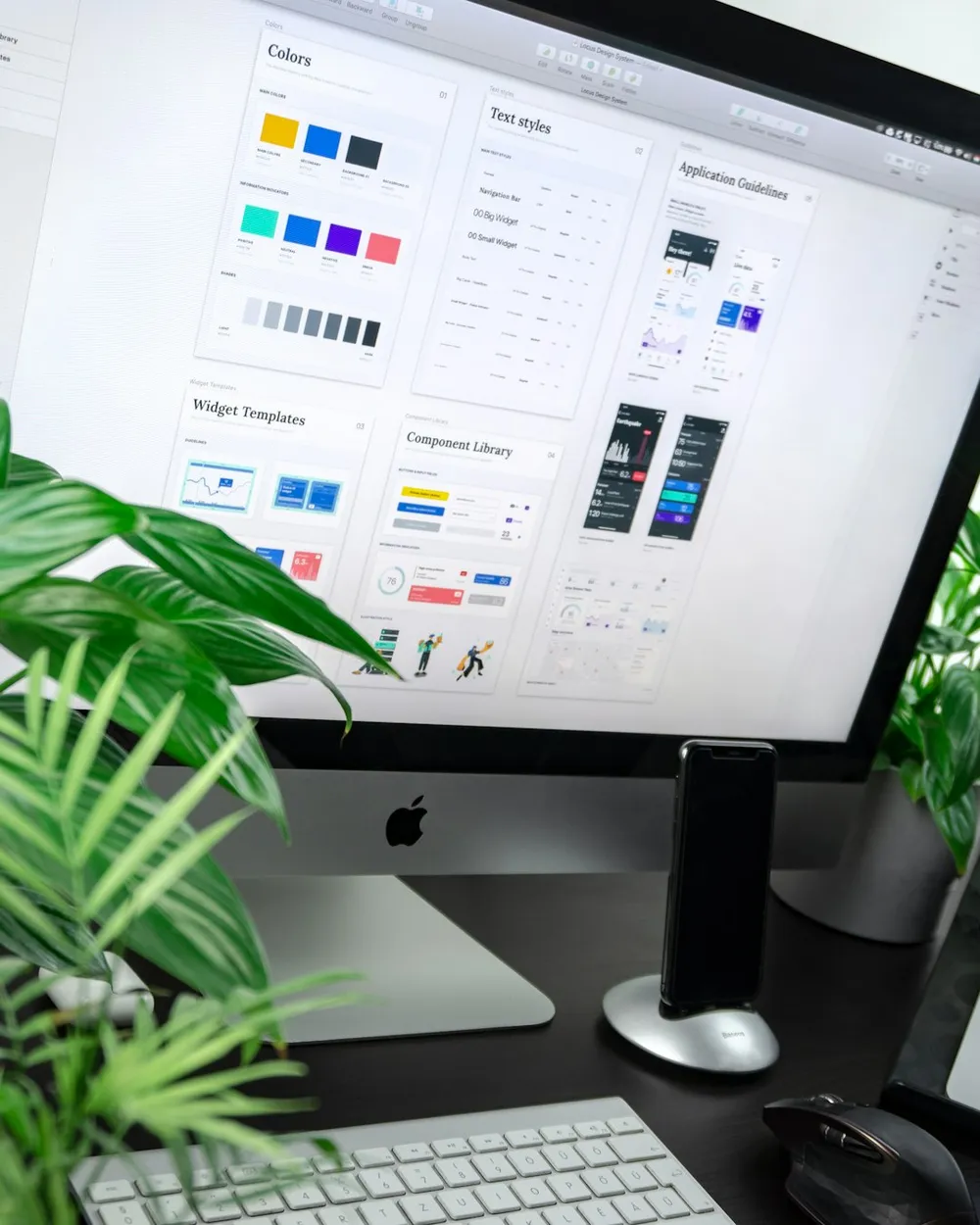
You have Brand Guidelines, templates, maybe even a component library – and yet every new touchpoint still feels a little different.
In this story, we’ll clearly separate the two: What does a brand manual do, what does a design system do – and why, in practice, you often need both.
By the end, you’ll have a decision framework for moving with your team from “We should be more consistent” to “This is how we’ll do it starting tomorrow.”


Anna
Strategy & Creative Direction
Role
Strategy & Creative Direction
Focus
Brand strategy, visual identity, UX/UI design and digital brand systems
Background
Photorealistic painting, experimental photography and brand and digital design
Perspective
Shaped by London’s galleries, cafés, shop windows and creative diversity
Approach
Precise, conceptual and with a strong eye for detail
PDFs and components solve different problems
We see this regularly: A team says “But we already have a design system,” and then shows a PDF with logo rules. Or the other way around: There’s a Figma library with buttons, but nobody can answer what the brand actually stands for – other than “modern.”
The confusion doesn’t come from people being imprecise. It arises because brand work and product work overlap in everyday practice. Marketing builds landing pages, Product builds features, HR builds recruiting pages. Everyone uses similar tools, everyone needs “design,” and suddenly different things end up being called the same thing.
On top of that: Software has changed brand work. In the past, you could solve a lot with a one-off print manual. Today, almost every brand touchpoint is a digital interface – and interfaces consist of reusable building blocks. That sounds like a design system. At the same time, a digital product needs a clear voice, values, examples of visual language, and tone of voice. That sounds like a brand manual.
That’s why our fresh perspective number one is: The problem isn’t the artifacts, but the missing translation between them. A brand manual without a connection to UI decisions remains “beautiful, but far away.” A design system without brand principles becomes “clean, but arbitrary.”
In practice, this shows up in small, costly friction points: five slightly different shades of green, three variants of the same wording, different spacing that doesn’t match in the code. Each individual deviation seems harmless, but together they cost time, spark discussions, and make your brand quieter.
To help you sort this out cleanly, we at Pola often use a simple mental model: The brand answers “Why and how do we sound?”, the system answers “How do we build it right every time?” From here on, things become clearer – and suddenly decisions can be made without starting from scratch every time.


The guardrail connects identity and expression
A brand handbook (often also called Brand Guidelines or Brand Guide) is the guardrail for identity and expression. It answers the questions that would otherwise come up again in every project: Who are we? How do we come across? How do we speak? And how can people recognize us – even when the logo and colors are not prominent?
If you imagine a brand as a person, the brand handbook is not their wardrobe, but their character profile. It describes attitude, tone, visual world, typographic mood and the rules that prevent the brand from slipping “into a different role” at every new touchpoint.
We find brand handbooks particularly helpful when multiple people create content: social media, website, PR, partnerships, sales, recruiting. Without a shared language, micro-deviations otherwise emerge that quickly feel like “patchwork”.
Our second fresh perspective is: A good brand handbook is not primarily a set of rules, but a decision-making tool. It should not only say what is forbidden, but show how you arrive at a fitting solution in new situations.
For this, we like to use a method in projects that we internally call the “Three Levels of Clarity”:
1) Principles: short sentences that guide the brand (e.g. “We explain without lecturing”).
2) Examples: before-and-after, good and bad applications, real copy blocks.
3) Boundaries: where the brand deliberately does not go along (e.g. no ironic tone, no stilted phrases).
Why does this work? Because teams rarely fail because of missing rules – but because of missing examples. A PDF with color codes is quickly made. But the difficult questions lie elsewhere: What does an error message sound like? What does a diagram look like? How do we talk about prices without hiding? That is exactly where a brand handbook brings calm to daily decisions.
And yes: It can be beautiful. But its real job is that you actually open it in everyday work – or even better: that it is so accessible digitally that it naturally becomes part of your workflow.
Rules also have to help in real situations
When teams say “brand handbook”, they often mean: logo, colors, typography – done. That is the visible part, but not the part that helps you in real situations.
In our practice at Pola, a brand handbook is good when it visual and verbal identity brings together. Because digital experiences consist not only of design, but of language: button texts, microcopy, error messages, confirmations, onboarding, forms. If this language is not guided, even the best UI suddenly feels cold or arbitrary.
A helpful piece of content is therefore not “Primary color: Green”, but rather: What function does green have for us? Does it stand for confidence, for nature, for clarity? And how far can the contrast go so that it remains accessible on screens? This is where brand guidelines and accessibility intersect. Since the requirements for digital accessibility in Europe have become practically noticeable in projects, “looks good” is simply no longer enough – it also has to work.
Our first practical model, which creates order surprisingly quickly in many projects, we call “Moments instead of media”. We structure guidelines not by channels (“Print”, “Social”, “Web”), but by situations in which people experience you:
- Explain: What do you sound like when you make complex things simple?
- Invite: What does an inquiry, a signup, a first contact feel like?
- Reassure: How do you communicate errors, delays, uncertainty?
- Empower: How do you show impact without exaggerating?
This creates a brand guide that is not tied to the media landscape, which is constantly changing, but to human needs, which remain.
Another point that many overlook: Examples are part of the system. Show real landing page heroes, real LinkedIn posts, real UI screens. Not as a gallery, but with comments: Why is this good? Which rule applies here? What would the common misinterpretation be?
When you have this kind of brand guide, it becomes a shared reference – not a PDF file that disappears into a folder after launch.

Do you want clarity on whether your brand guide is practical for everyday use?
Show us how brand, product and communication work together today. We make visible where guidance or consistency is lacking, and define a clear framework for the next decisions.



Consistency becomes something teams can build
A design system is what happens when you no longer want to “hope” for consistency, but buildable make it. It is the shared foundation that allows design and development to speak the same language – and ensures that new pages, features and flows do not have to be reinvented every time.
Important: A design system is not automatically a Figma library. A library is one part of it. A system only emerges when rules, components and technical implementation work together.
Our third fresh perspective is: A design system is a quality promise to your own team. Not to the outside world. It reduces decision stress („How big is a button here?“), prevents drift („Why does the modal look different?“) and makes accessibility, performance and consistency repeatable.
In practice, we often see two typical starting points:
First: A product grows. More features, more teams, more releases. Without a system, a UI emerges that somehow works, but knows more and more special cases. Every new component then costs not only design time, but also review time, QA time and discussions.
Second: A brand grows into digital channels. Suddenly there is not just a website, but also a portal, an app, a dashboard, perhaps a shop. Here, a design system helps because it standardizes repetition.
And this is where our second method comes into play, which we often use to set up systems pragmatically: „Minimum Lovable System“. Not maximal, but minimal – yet in a way that people like to use it.
We don't start with „all components“, but with the few that really appear everywhere: typography scale, spacing, colors as tokens, buttons, inputs, navigation, feedback components. As soon as these building blocks are stable, the system grows along real product work. This prevents a months-long „system project“ that nobody maintains in the end.
If you're wondering where the whole thing lives: Often in a combination of design (e.g. Figma), documentation (e.g. Storybook or Zeroheight) and code. What matters less is the tool than the commitment: Where is the source of truth, and who decides when things get contentious?
Tokens and components need an internal logic
If you think of a design system only as a component list, you're missing what makes it stable. A pure „UI kit“ is quick to create, but it doesn't prevent teams from interpreting it differently. A system needs an internal logic.
At its core, a design system consists of three levels that reinforce each other:
First: Design Tokens. These are the smallest building blocks such as colors, spacing, font sizes, radii, shadows – as named values that are used identically in design and code. Tokens are where brand and technology meet: „Primary 600“ is not just a color value, but a decision about how strongly your brand speaks in the interface.
Second: Components. Buttons, inputs, cards, modals. This is not just about appearance, but about states (Hover, Disabled, Error), behavior and accessibility. If you work cleanly here, you not only save design time, but also prevent every developer from building their own variants.
Third: Patterns and rules. These are recurring solutions for real problems: forms, tables, filters, checkout, onboarding, empty states. Patterns are the part that really influences product quality because they standardize user guidance.
What many underestimate is documentation as the “fourth in the group”. It is not decoration, but the bridge. Without documentation, teams do not know when to use which component, which exceptions are okay and which are not.
This is where our practical principle “Source of Truth first” comes in: We establish early, where something is decided.
- Visual truth: Figma.
- Technical truth: component code and versioning.
- Rule truth: documentation.
If you do not establish this, the fastest channel always wins – usually a screenshot in the chat.
And because Pola works a lot with purpose-oriented teams, we also look at a point that is often neglected in many systems: Sustainability in the interface. Less complexity often means less overhead, fewer unnecessary variants, less media bloat. This is not backed by a number from a study, but by our project experience: Systems that start minimally and grow cleanly are not only easier to maintain, but often also lead to leaner frontends.
A design system is therefore not “design”. It is an agreement on how you build digitally.


One explains, the other operationalizes
The clearest distinction is simple: A brand manual describes who you are. A design system ensures that this can be implemented consistently everywhere.
In everyday work, this means: The brand manual is often aimed at communications, marketing, content, partnerships – and increasingly at product teams as language and UI converge. The design system is aimed at designers and developers, at everyone who builds interfaces.
The scope is also different. A brand manual often includes things that never appear in the UI: photography style, illustrations, tone of voice in PR, claims, narratives. A design system, on the other hand, generally stays within digital products and websites: layout principles, components, patterns, states.
And then there is the update rhythm. A brand manual rarely changes weekly. It can remain stable for years, with occasional updates. A design system, by contrast, lives closer to the product: New features bring new patterns, bug fixes change components, accessibility improvements need to be incorporated.
What helps us in projects is a small diagnostic question that you can use immediately: When you make a decision – is that a statement about identity or about implementation?
“We use the informal ‘you’ with our users and write clearly” is identity. Brand manual.
“A Primary Button always has a minimum height of X and clear focus states” is implementation. Design system.
The most common mistake is to force both into one document. Then the brand handbook becomes too technical and loses everyone who creates content. Or the design system becomes too “brandy” and nobody knows what actually applies in the code.
A second mistake is getting the order wrong. Some teams build a huge design system first, even though the brand is not yet clear. This leads to a very consistent interface that still feels interchangeable. Other teams perfect a brand handbook, but rebuild websites and product parts from scratch every time. This leads to a strong brand on paper – and chaos in the UI.
If you notice that you are constantly arguing about “taste”, you often lack brand clarity. If you are constantly arguing about “details”, you often lack system clarity.
Separating the two is not formalism. It is a relief.
Consistency needs clearly assigned responsibility
Even the best brand handbook and the cleanest design system lose their value if nobody is responsible. Consistency is not a state. It is maintenance.
In many organizations, ownership has grown historically: Brand sits in Marketing, UI sits in Product, code sits in Development. That is normal. It becomes problematic when there is no shared “translation zone”. Then Marketing decides on colors in a rebranding, while the product team does not touch tokens because they are “too risky”. Or the product team builds new components that do not fit the tone because language was never part of the system.
What we therefore establish early at Pola is a simple governance model that does not sound like bureaucracy. Our approach is called “Two doors, one source”:
The first door is Brand decision: What defines the identity? Tone, visual language, core principles, brand colors in terms of their meaning.
The second door is System decision: What must apply for quality, accessibility and reusability? Tokens, component APIs, patterns.
Both doors lead to the same source of truth: documentation that clearly states what applies and since when.
In practical terms: We like to work with versioning as in software. A design system is rarely “finished”, but it can have releases. Even simple semantics like “v1.2: new input states, v1.3: improved focus handling” ensure that teams can trace changes.
Tooling helps, but does not replace responsibility. As a combination, we often see:
- Design: Figma
- Docs: Storybook or Notion for faster texts
- Tickets and maintenance: a backlog (Jira, Linear, Trello – whatever you already use)
And here comes the point that is rarely said openly: Governance must fit your team size. A two-person team doesn’t need a committee. It needs a clear rule: Who decides in case of doubt, and where is it documented?
If you’re looking for a starting point, take this mini-agreement with you: “No new component without documentation. No new brand rule without an example.” It sounds small, but it is often the difference between a system that lives and a system that slowly falls apart.
You want to know what will really help you next?
Bring your existing positioning, design assets and open questions. Together, we’ll sort out what is already working, what should be sharpened and what system your team really needs.


Your day-to-day work determines the right order
The honest answer is: It doesn’t depend on your industry, but on your day-to-day work.
If you have a small team and mainly build communication touchpoints – website, social, campaigns, perhaps a newsletter – then a good brand handbook often has the biggest impact first. Because it immediately prevents every new page from being created “by feel”. You gain clarity in language, visual world and basic design.
If, on the other hand, you’re building a digital product that is regularly expanded, then a design system becomes relevant earlier. Not because it looks “more professional”, but because it organizes repetition. The savings show up not only in design hours, but in fewer coordination rounds, fewer QA cycles, fewer “Why is this different here?” tickets.
In consulting, we like to use a quick decision question that works surprisingly well: Where are you currently losing more energy – in discussions or in repetition?
If discussions dominate (“How should this sound?”, “What fits us?”), brand governance is missing.
If repetition dominates (“Can you build this exactly like that again?”), system governance is missing.
One point that has become more important for many teams in 2026: accessibility. If you already have to touch the UI to improve contrasts, focus states, semantic structures or component behavior, this is often a good moment to bring along design system topics. In many projects, accessibility is the point where “rules” suddenly become concrete – and therefore system-ready.
And one more very practical perspective: Budget and maintenance capacity. A brand handbook can remain stable with less ongoing maintenance. A design system is a living product. If you don’t have the capacity to maintain it, it’s better to start smaller (Minimum Lovable System) or begin with tokens and the most important components.
If you have to choose between the two, we often recommend a hybrid sequence: First make brand principles and tone of voice clear enough to guide UI decisions – and then implement the system where the most repetition occurs.
This way, you’re not choosing “either or”, but building step by step a foundation that genuinely takes the pressure off your team.
Principles become experiences through tokens
The best impact comes when the brand guidelines and design system don’t duplicate each other, but connect.
We like to think of it as a chain: Brand principles guide tokens, tokens guide components, components guide experiences. Once you consciously close this chain, consistency becomes almost automatic.
A real-life example: Let’s say your brand stands for calm and clarity. In the brand guidelines, this is described as a principle, with text examples („short sentences, active verbs“) and visual language („lots of space, natural materials“). If this attitude doesn’t make it into the system, the UI will still feel hectic: too many accent colors, too many shadows, spacing that’s too tight.
In a connected setup, you translate the principle into system decisions. „Calm“ becomes spacing tokens, a type scale with enough line height, reduced component variants. „Clarity“ becomes unambiguous states, highly legible contrasts, consistent microcopy.
Our tried-and-tested way of making this translation tangible is called „Brand to Build“. It consists of three short steps that you can also initiate internally:
1) Choose three brand principles, that are genuinely guiding.
2) Define two UI consequences per principle, that you map in the system (e.g. „Clarity“ → focus states are never optional, texts are always action-oriented).
3) Document one example screen per principle, so it doesn’t remain abstract.
This helps you avoid the common problem of brand work staying “up top” while the design system runs “down below” without a soul.
And one point we find particularly important for purpose-driven organizations: The interplay is also a question of impact. If you want to build trust digitally, the experience has to be consistent. Not perfect. But coherent. That creates orientation – and orientation is often the prerequisite for people to take action: donate, sign up, buy, get involved.
If you like, you can check your current status as a next step: Do you have brand guidelines without a system connection or a system without brand governance? The answer is rarely “both perfect”. But it shows you pretty clearly where you should start.
FAQ
If you only have a few digital touchpoints and hardly any product development, a strong brand manual that brings language and design together is often enough.
But as soon as you regularly build new UI flows or several teams work on the interface in parallel, a design system quickly becomes a relief.
In many cases, the best solution is not “both immediately”, but a sensible sequence: first sharpen the brand principles, then systematize the most frequently used UI building blocks.
Figma is a very good place for the visual source of truth, but a design system is more than a library.
Without rules, states, accessibility requirements and ideally a code counterpart, you quickly end up with a pretty collection that everyone uses differently.
If you want to work sustainably, you need at least clear documentation alongside Figma that says when something is used – and who approves changes.
The terms are often used synonymously. In practice, many people use “Brand Guidelines” to mean more of the visual part (logo, colors, typography).
We like to use “brand manual” for the more holistic view: including tone of voice, messaging, examples and decision-making logic.
What matters less is the name than the content: Does it help you make coherent decisions quickly in new situations?
By treating it like a product: with ownership, a small maintenance backlog and a clear place for changes.
A pragmatic starting point is a “Minimum Lovable System”: tokens and the most important components, then growth based on real requirements.
A simple rule also helps: No new component without documentation – and no change without a brief note explaining what has improved for users or developers.
That depends heavily on scope, maturity level and whether you are starting from scratch or building on what already exists.
A brand manual can be relatively focused if the identity is already clear, or larger if positioning, language and visual world need to be reorganized.
A design system is often more demanding to maintain than to create, because it grows along with the product. We recommend budgeting not only for “setup”, but also for ongoing system maintenance.
If your brand is currently unclear or drifting significantly visually, a rebranding or brand refinement can make sense before you standardize the UI.
Otherwise, you build a very consistent system on top of an identity that will be changed again anyway later.
But if you urgently need to stabilize product quality (e.g. due to growth, accessibility, or many bugs), a lean system launch can work in parallel with the brand work – but then deliberately minimal.
By anchoring tone of voice where it is needed: in microcopy rules, examples, and component text.
Instead of filling the design system with long brand texts, a few clear language principles plus concrete UI examples (e.g. for error messages, confirmations, Empty States) are often enough.
This keeps the system usable – while language remains repeatable and consistent.